hexo-theme-butterfly 主题是基于 hexo-theme-melody 的基础上进行开发的。
本帖的主要目的是用最平实的语言描述博客美化的进程,同时在每个章节为可能涉及的知识点提供相应的工具网站以供读者学习。当然,最重要的是给我自己留个魔改的日记。这样升级主题玩崩了也能找到回家的路。
Butterfly 主题安装
参考自文章:https://butterfly.js.org/posts/21cfbf15/
Butterfly 主题安装支持:
Git 安装(Github 和 Gitee)
NPM 安装
① GitHub安装 ② Gitee安装 ③ NPM安装 在你的 Hexo 根目录里执行:
1 git clone -b master https://github.com/jerryc127/hexo-theme-butterfly.git themes/butterfly
在你的 Hexo 根目录里执行:
1 git clone -b master https://gitee.com/immyw/hexo-theme-butterfly.git themes/butterfly
此方法只支持 Hexo 5.0.0 以上版本
通过 npm 安装并不会在 themes 里生成主题文件夹,而是在 node_modules 里生成
在你的 Hexo 根目录里执行:
1 npm i hexo-theme-butterfly
升级方法:在 Hexo 根目录下,运行 npm update hexo-theme-butterfly
应用主题 修改 Hexo 根目录下的 _config.yml,把主题改为 butterfly:
安装插件 如果你没有 pug 以及 stylus 的渲染器,请下载安装:
1 npm install hexo-renderer-pug hexo-renderer-stylus --save
升级建议 为了减少升级主题后带来的不便,请使用以下方法:
在 hexo 的根目录创建一个文件 _config.butterfly.yml,并把主题目录的 _config.yml 内容复制到 _config.butterfly.yml 去,以后只需要在 _config.butterfly.yml 进行配置就行。
Butterfly 主题美化
鉴于每个人的根目录名称都不一样,本帖博客根目录 一律以[Blogroot]指代。
本帖涉及魔改源码的内容,会使用diff代码块 标识,复制时请不要忘记删除 前面的+、-符号。
因为.pug和.styl以及.yml等对缩进要求较为严格,请尽量不要使用记事本等无法提供语法高亮的文本编辑器 进行修改。
本帖基于Butterfly主题进行魔改方案编写,因此请读者优先掌握 Butterfly主题官方文档 的内容后再来进行魔改。以避免不必要的兼容性问题。
基础美化 一些基础的 Butterfly 美化方案在官方文档中均可以找到,所以请先熟读 Butterfly主题官方文档 。
生成文章唯一链接 转自 HuRan Blog《利用Hexo-abbrlink插件生成唯一文章链接》 仅用于学习。
Hexo的默认文章链接格式是年,月,日,标题这种格式来生成的。如果你的标题是中文的话,那你的URL链接就会包含中文,
复制后的URL路径就是把中文变成了一大堆字符串编码,如果你在其他地方用这边文章的url链接,偶然你又修改了改文章的标题,那这个URL链接就会失效。为了给每一篇文章来上一个属于自己的链接,写下此教程,利用 hexo-abbrlink 插件,A Hexo plugin to generate static post link based on post titles ,来解决这个问题。 参考github官方: hexo-abbrlink 按照此教程配置完之后如下:
1、安装插件,在博客根目录 [Blogroot] 下打开终端,运行以下指令:
1 npm install hexo-abbrlink --save
2、插件安装成功后,在根目录 [Blogroot] 的配置文件 _config.yml 找到 permalink:
1
2
3
4
5
6
- permalink: :year/:month/:day/:title/ #修改为 + permalink: post/:abbrlink.html # post为自定义前缀 + abbrlink: + alg: crc32 #算法: crc16(default) and crc32 + rep: hex #进制: dec(default) and hex
公告2个小人 1、在Butterfly/layout/includes/widget/card_announcement.pug下添加如下代码:
1 2 3 4 5 6 7 8 9 10 11 12 13 14 15 16 17 .xpand (style='height:200px;' ) canvas.illo (width='800' height='800' style='max-width: 200px; max-height: 200px; touch-action: none; width: 640px; height: 640px;' ) script (src='https://cdn.jsdelivr.net/gh/xiaopengand/blogCdn@latest/xzxr/twopeople1.js' )script (src='https://cdn.jsdelivr.net/gh/xiaopengand/blogCdn@latest/xzxr/zdog.dist.js' )script#rendered-js (src='https://cdn.jsdelivr.net/gh/xiaopengand/blogCdn@latest/xzxr/twopeople.js' ) style. .card -widget.card -announcement { margin : 0 ; align-items : center; justify-content : center; text-align : center; } canvas { display : block; margin : 0 auto; cursor : move; }
星空背景和流星特效
转自 Justlovesmile 《如何让你的博客拥有星空背景和流星特效》 仅用于学习
1、在 [Blogroot]\themes\source\js\ 目录下新建 universe.js 输入:
1
2
function dark (window .requestAnimationFrame =window .requestAnimationFrame ||window .mozRequestAnimationFrame ||window .webkitRequestAnimationFrame ||window .msRequestAnimationFrame ;var n,e,i,h,t=.05 ,s=document .getElementById ("universe" ),o=!0 ,a="180,184,240" ,r="226,225,142" ,d="226,225,224" ,c=[];function f (window .innerWidth ,e=window .innerHeight ,i=.216 *n,s.setAttribute ("width" ,n),s.setAttribute ("height" ,e)}function u (clearRect (0 ,0 ,n,e);for (var t=c.length ,i=0 ;i<t;i++){var s=c[i];s.move (),s.fadeIn (),s.fadeOut (),s.draw ()}}function y (this .reset =function (this .giant =m (3 ),this .comet =!this .giant &&!o&&m (10 ),this .x =l (0 ,n-10 ),this .y =l (0 ,e),this .r =l (1.1 ,2.6 ),this .dx =l (t,6 *t)+(this .comet +1 -1 )*t*l (50 ,120 )+2 *t,this .dy =-l (t,6 *t)-(this .comet +1 -1 )*t*l (50 ,120 ),this .fadingOut =null ,this .fadingIn =!0 ,this .opacity =0 ,this .opacityTresh =l (.2 ,1 -.4 *(this .comet +1 -1 )),this .do =l (5e-4 ,.002 )+.001 *(this .comet +1 -1 )},this .fadeIn =function (this .fadingIn &&(this .fadingIn =!(this .opacity >this .opacityTresh ),this .opacity +=this .do )},this .fadeOut =function (this .fadingOut &&(this .fadingOut =!(this .opacity <0 ),this .opacity -=this .do /2 ,(this .x >n||this .y <0 )&&(this .fadingOut =!1 ,this .reset ()))},this .draw =function (if (h.beginPath (),this .giant )h.fillStyle ="rgba(" +a+"," +this .opacity +")" ,h.arc (this .x ,this .y ,2 ,0 ,2 *Math .PI ,!1 );else if (this .comet ){h.fillStyle ="rgba(" +d+"," +this .opacity +")" ,h.arc (this .x ,this .y ,1.5 ,0 ,2 *Math .PI ,!1 );for (var t=0 ;t<30 ;t++)h.fillStyle ="rgba(" +d+"," +(this .opacity -this .opacity /20 *t)+")" ,h.rect (this .x -this .dx /4 *t,this .y -this .dy /4 *t-2 ,2 ,2 ),h.fill ()}else h.fillStyle ="rgba(" +r+"," +this .opacity +")" ,h.rect (this .x ,this .y ,this .r ,this .r );h.closePath (),h.fill ()},this .move =function (this .x +=this .dx ,this .y +=this .dy ,!1 ===this .fadingOut &&this .reset (),(this .x >n-n/4 ||this .y <0 )&&(this .fadingOut =!0 )},setTimeout (function (1 },50 )}function m (t ){return Math .floor (1e3 *Math .random ())+1 <10 *t}function l (t,i ){return Math .random ()*(i-t)+t}f (),window .addEventListener ("resize" ,f,!1 ),function (getContext ("2d" );for (var t=0 ;t<i;t++)c[t]=new y,c[t].reset ();u ()}(),function t (document .getElementsByTagName ('html' )[0 ].getAttribute ('data-theme' )=='dark' &&u (),window .requestAnimationFrame (t)}()};dark ()
2、在 [Blogroot]\themes\source\css\ 目录下新建 universe.css 输入:
1 2 3 4 5 6 7 8 9 10 11 12 13 14 15 #universe { display : block; position : fixed; margin : 0 ; padding : 0 ; border : 0 ; outline : 0 ; left : 0 ; top : 0 ; width : 100% ; height : 100% ; pointer-events : none; z-index : -1 ; }
3、在 [Blogroot]\_config.butterfly.yml 的 inject 配置项中 bottom 下填入:
1
2
3
4
5
inject: bottom: + # 星空背景 + - <canvas id="universe"></canvas> + - <script defer src="/js/universe.js"></script>
4、在 [Blogroot]\_config.butterfly.yml 的 inject 配置项中 head 下填入:
1
2
3
4
inject: head: + ## 星空背景 + - <link rel="stylesheet" href="/css/universe.css">
天气小部件
转自 小孙同学《Butterfly 主题添加天气小部件》 仅用于学习。
申请天气 API 国内天气API有多种,此处推荐 和风天气 ,如果您第一次使用和风天气,首先,您应该去官网注册一个账号, 点我进入
申请账号并登录后,请到 和风天气开发平台 点我进入
配置插件的相关属性,首先,您应该为您的插件取一个名字,内容属性均可以自定义。
注意:为了确保天气小部件的正常显示,这里选择固定在浏览器中,具体位置后续在调节。
设置完成后,选择下面的生成代码即可,生成的代码如下:
1 2 3 4 5 6 7 8 9 10 11 12 13 14 15 16 17 18 19 20 21 22 23 24 25 26 27 <div id ="he-plugin-simple" > </div > <script > WIDGET = { "CONFIG" : { "modules" : "01234" , "background" : "5" , "tmpColor" : "FF9900" , "tmpSize" : "16" , "cityColor" : "4A86E8" , "citySize" : "16" , "aqiColor" : "FF9900" , "aqiSize" : "16" , "weatherIconSize" : "24" , "alertIconSize" : "18" , "padding" : "10px 10px 10px 10px" , "shadow" : "0" , "language" : "auto" , "fixed" : "true" , "vertical" : "top" , "horizontal" : "left" , "left" : "10" , "top" : "10" , "key" : "您自己的key" } } </script > <script src ="https://widget.qweather.net/simple/static/js/he-simple-common.js?v=2.0" > </script >
添加 <div> 打开您的博客所在文件夹,在 blog\themes\butterfly\layout\includes\headers 目录下的 nav.pug 文件中添加以下内容。
1 <div id ="he-plugin-simple" > </div >
添加 weather.js 打开您的博客所在文件夹,在 blog\themes\butterfly\source\js 目录下添加 weather.js 文件,并填入一下内容。
1
2
3
4
5
6
7
8
9
10
11
12
13
14
15
16
17
18
19
20
21
22
23
WIDGET = { "CONFIG" : { "modules" : "01234" , "background" : "5" , "tmpColor" : "4A86E8" , "tmpSize" : "16" , "cityColor" : "FF9900" , "citySize" : "16" , "aqiColor" : "4A86E8" , "aqiSize" : "16" , "weatherIconSize" : "24" , "alertIconSize" : "18" , "padding" : "0px 0px 0px 0px" , "shadow" : "0" , "language" : "auto" , "fixed" : "true" , "vertical" : "center" , "horizontal" : "center" , "left" : "125" , "top" : "20" , "key" : "你的key" } }
Inject 引入 在配置文件 _config.butterfly 的 inject 属性中引入以下代码。
1
2
3
4
5
inject: bottom: + ## 和风天气 + - <script async src="/js/weather.js"></script> + - <script src="https://widget.qweather.net/simple/static/js/he-simple-common.js?v=2.0"></script>
引入阿里矢量图标库
转自 Akilar《confont Inject》 仅用于学习。
阿里图标库全名阿里巴巴矢量图标库。提供了丰富的免费图标资源。并且支持多种引入方式。
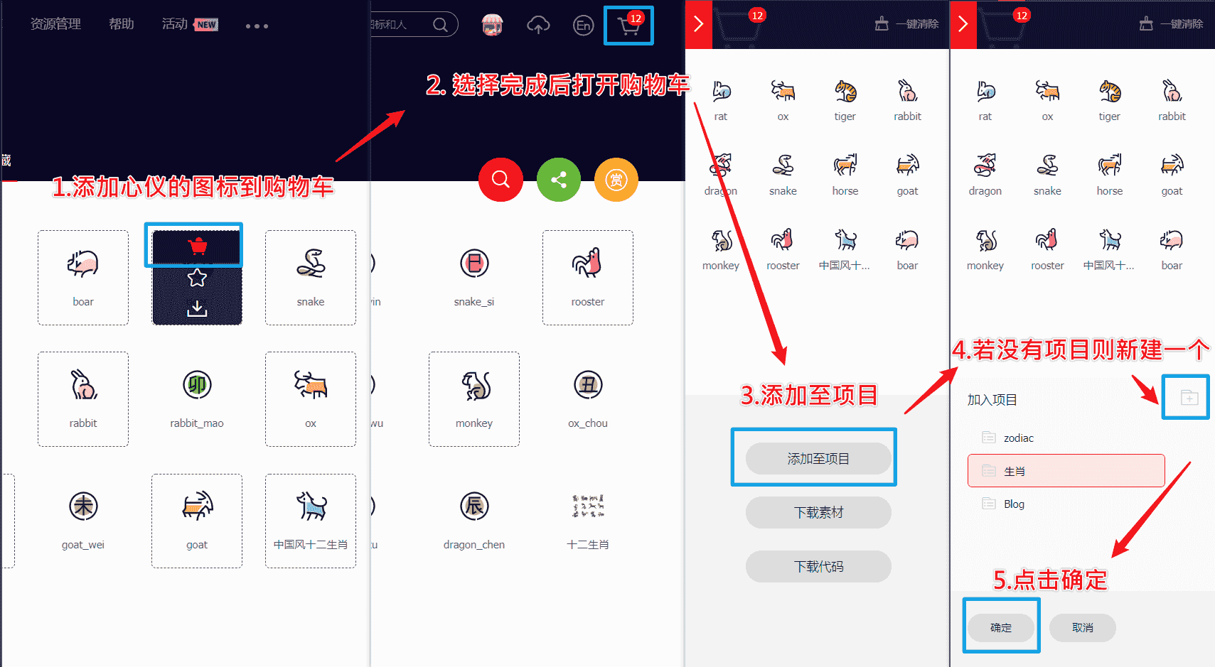
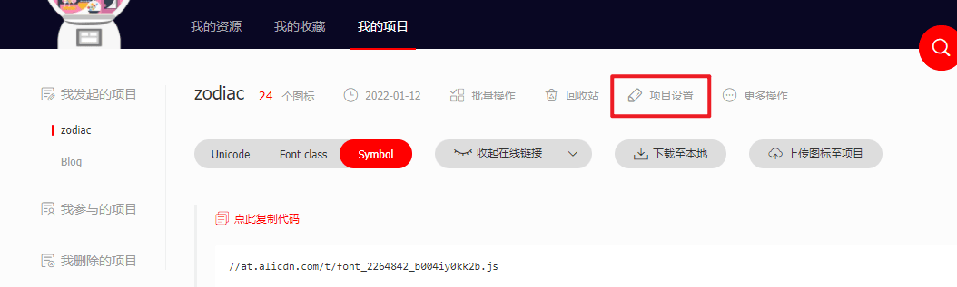
新建图标项目 1、访问 阿里巴巴矢量图标库 , 注册登录。
2、搜索自己心仪的图标,然后选择添加入库 ,加到购物车。
3、选择完毕后点击右上角的购物车图标,打开侧栏,选择添加到项目,如果没有项目就新建一个。
4、可以通过上方顶栏菜单 -> 资源管理 -> 我的项目,找到之前添加的图标项目。
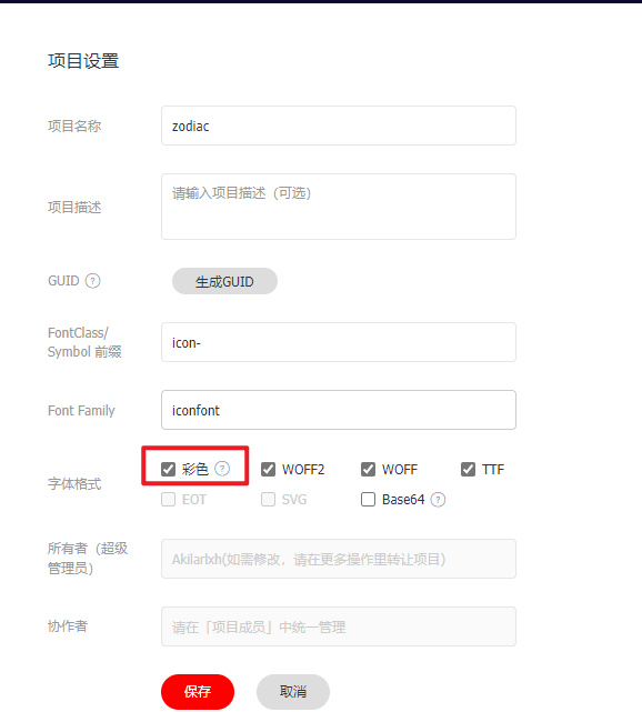
5、现在的 iconfont 可以在图标库的项目设置里直接打开彩色设置,然后采用 fontclass 的引用方式即可使用多彩图标。但是单一项目彩色图标上限是 40 个图标 ,酌情采用。
引入图标 1、找到之前新建的图标项目,选择Symbol->查看在线链接,获取 Symbol.js 的在线链接,并引入。在 [Blogroot]\_config.butterfly.yml 的 inject 配置项中填入:
1
2
3
4
inject: head: bottom: + - <script async src="//at.alicdn.com/t/font_2264842_3izu8i5eoc2.js"></script>
2、打开 [Blogroot]\themes\butterfly\source\css\custom.css, 输入以下内容:
1 2 3 4 5 6 7 svg.icon { width : 1em ; height : 1em ; vertical-align : -0.15em ; fill: currentColor; overflow : hidden; }
3、添加外挂标签,在 [Blogroot]\themes\butterfly\scripts\tag\ 目录下新建 iconfont.js,打开 [Blogroot]\themes\butterfly\scripts\tag\iconfont.js, 输入:
1
2
3
4
5
6
7
8
9
10
'use strict' ;function iconFont (args ) { args = args.join (' ' ).split (',' ) let p0 = args[0 ] let p1 = args[1 ]?args[1 ]:1 return `<svg class="icon" style="width:${p1} em; height:${p1} em" aria-hidden="true"><use xlink:href="#${p0} "></use></svg>` ; } hexo.extend .tag .register ('icon' ,iconFont);
hexo cl && hexo g 以后即可使用外挂标签的形式来写入图标了。
封面节日挂件效果 1、新建 [Blogroot]\themes\butterfly\scripts\festival.js:
1 2 3 4 5 6 7 8 9 10 11 12 13 14 15 16 17 hexo.extend .helper .register ('getFestivalIcon' , function ( var icon = [ '#icon-qiandai' , '#icon-denglong' , '#icon-juanzhou' , '#icon-hongbao' , '#icon-duilian' , '#icon-bianpao' , '#icon-shanzi' , '#icon-tangguo' , '#icon-yuanbao' , '#icon-qianchuan' , '#icon-denglong2' ] var index = Math .floor (Math .random ()*icon.length ); return icon[index] });
2、修改 [Blogroot]\themes\butterfly\layout\includes\mixins\post-ui.pug:
1
2
3
4
5
6
7
8
9
if post_cover && theme.cover.index_enable .post_cover(class=leftOrRight) a(href=url_for(link) title=title) + svg.icon.festival-decoration(aria-hidden="true") + use(xlink:href=getFestivalIcon()) if theme.lazyload.enable img.post_bg(data-lazy-src=url_for(post_cover) onerror=`this.onerror=null;this.src='`+ url_for(theme.error_img.post_page) + `'` alt=title) else img.post_bg(src=url_for(post_cover) onerror=`this.onerror=null;this.src='`+ url_for(theme.error_img.post_page) + `'` alt=title)
3、新建 [Blogroot]\themes\butterfly\source\css\custom.css:
1 2 3 4 5 6 7 8 9 10 11 12 13 14 15 16 17 18 19 20 21 22 23 24 25 26 27 28 29 30 31 svg.icon .festival-decoration { width : 3em ; height : 3em ; left : 2em ; margin-bottom : -3em ; display : block; z-index : 100 ; position : relative; -webkit-animation : sway 1s infinite ease-in-out alternate; animation : sway 1s infinite ease-in-out alternate; } @-webkit-keyframes sway { 0% { -webkit-transform : rotate (20deg ); transform-origin : center top; } 100% { -webkit-transform : rotate (-20deg ); transform-origin : center top; } } @keyframes sway { 0% { transform : rotate (20deg ); transform-origin : center top; } 100% { transform : rotate (-20deg ); transform-origin : center top; } }
4、修改_config.butterfly.yml 的 inject 配置项,引入 custom.css 和 iconfont 的 js,此处为我的图标库链接,熟练掌握前置教程后可以换成自己的:
1
2
3
4
5
6
7
# 插入代码到头部 </head> 之前 和 底部 </body> 之前 inject: head: - <link rel="stylesheet" href="/css/custom.css" media="defer" onload="this.media='all'"> #教学用样式 bottom: # 阿里矢量图标 - <script async src="//at.alicdn.com/t/font_2032782_ev6ytrh30f.js"></script>
时间轴生肖图标
转自 Akilar《Archive Beautify》 仅用于学习。
需要使用阿里矢量图标的 symbol 引入方案,为彩色图标。
1、在 [Blogroot]\themes\butterfly\scripts\ 目录下新建 year.js,并在 [Blogroot]\themes\butterfly\scripts\year.js 中输入以下内容:
1 2 3 4 5 6 7 8 9 10 11 12 13 14 15 16 17 18 hexo.extend .helper .register ('getAnimalIcon' , function (year ) { var index = parseInt (year) % 12 ; var icon = { 0 : 'icon-monkey' , 1 : 'icon-rooster' , 2 : 'icon-dog' , 3 : 'icon-boar' , 4 : 'icon-rat' , 5 : 'icon-ox' , 6 : 'icon-tiger' , 7 : 'icon-rabbit' , 8 : 'icon-dragon' , 9 : 'icon-snake' , 10 : 'icon-horse' , 11 : 'icon-goat' , } return icon[index] });
2、在 [Blogroot]\_config.butterfly.yml 的 inject 配置项中填入我的生肖图标线上链接,并引入自定义 css 文件(没有 custom.css 文件的可以自己新建一个 [Blogroot]\themes\butterfly\source\css\custom.css):
1
2
3
4
5
inject: head: + - <link rel="stylesheet" href="/css/custom.css" media="defer" onload="this.media='all'"> bottom: + - <script async src="//at.alicdn.com/t/font_2264842_3izu8i5eoc2.js"></script>
此处 async 是异步加载属性,能够减少 HTML 阻塞。
3、打开 [Blogroot]\themes\butterfly\source\css\custom.css, 输入以下内容:
1 2 3 4 5 6 7 8 svg.icon { width : 1em ; height : 1em ; vertical-align : -0.15em ; fill: currentColor; overflow : hidden; }
4、修改 [Blogroot]\themes\butterfly\layout\includes\mixins\article-sort.pug,第 7 行开始,注意缩进。
1
2
3
4
5
6
7
8
9
10
11
- let title = article.title || _p('no_title') + - let iconAnimal = '#'+ getAnimalIcon(tempYear) if tempYear !== year - year = tempYear - .article-sort-item.year= year + .article-sort-item.year + span= year + svg.icon(aria-hidden='true') + use(xlink:href=iconAnimal) .article-sort-item(class=no_cover) if article.cover && theme.cover.archives_enable
添加看板娘
转自 Akilar《Live2d Widget》 仅用于学习。
1、在[Blogroot]\themes\butterfly\source\目录下打开终端,输入:
1 git clone https://github.com/stevenjoezhang/live2d-widget.git live2d-widget
2、找到路径[Blogroot]\themes\butterfly\source\live2d-widget\autoload.js,打开autoload.js,修改内容:
1
2
- const live2d_path = "https://cdn.jsdelivr.net/gh/stevenjoezhang/live2d-widget/"; + const live2d_path = "/live2d-widget/";
3、在Butterfly的主题配置文件[Blogroot]\_config.butterfly.yml中,butterfly主题其实自带fontawesome依赖,无需引入,
1
2
3
4
5
6
7
8
9
# Inject # Insert the code to head (before '</head>' tag) and the bottom (before '</body>' tag) # 插入代码到头部 </head> 之前 和 底部 </body> 之前 inject: head: # - <link rel="stylesheet" href="/xxx.css"> bottom: # - <script src="xxxx"></script> + - <script defer src="/live2d-widget/autoload.js"></script>
昼夜转换动画
转自 Akilar《添加白天夜间模式转换动画》 仅用于学习。
1、新建 [Blogroot]\themes\butterfly\layout\includes\custom\sun_moon.pug, 这部分其实实质上就是一个 svg 文件,通过 js 操作它的旋转显隐,淡入淡出实现动画效果。
1
2
3
4
5
6
7
8
9
svg(aria-hidden='true', style='position:absolute; overflow:hidden; width:0; height:0') symbol#icon-sun(viewBox='0 0 1024 1024') path(d='M960 512l-128 128v192h-192l-128 128-128-128H192v-192l-128-128 128-128V192h192l128-128 128 128h192v192z', fill='#FFD878', p-id='8420') path(d='M736 512a224 224 0 1 0-448 0 224 224 0 1 0 448 0z', fill='#FFE4A9', p-id='8421') path(d='M512 109.248L626.752 224H800v173.248L914.752 512 800 626.752V800h-173.248L512 914.752 397.248 800H224v-173.248L109.248 512 224 397.248V224h173.248L512 109.248M512 64l-128 128H192v192l-128 128 128 128v192h192l128 128 128-128h192v-192l128-128-128-128V192h-192l-128-128z', fill='#4D5152', p-id='8422') path(d='M512 320c105.888 0 192 86.112 192 192s-86.112 192-192 192-192-86.112-192-192 86.112-192 192-192m0-32a224 224 0 1 0 0 448 224 224 0 0 0 0-448z', fill='#4D5152', p-id='8423') symbol#icon-moon(viewBox='0 0 1024 1024') path(d='M611.370667 167.082667a445.013333 445.013333 0 0 1-38.4 161.834666 477.824 477.824 0 0 1-244.736 244.394667 445.141333 445.141333 0 0 1-161.109334 38.058667 85.077333 85.077333 0 0 0-65.066666 135.722666A462.08 462.08 0 1 0 747.093333 102.058667a85.077333 85.077333 0 0 0-135.722666 65.024z', fill='#FFB531', p-id='11345') path(d='M329.728 274.133333l35.157333-35.157333a21.333333 21.333333 0 1 0-30.165333-30.165333l-35.157333 35.157333-35.114667-35.157333a21.333333 21.333333 0 0 0-30.165333 30.165333l35.114666 35.157333-35.114666 35.157334a21.333333 21.333333 0 1 0 30.165333 30.165333l35.114667-35.157333 35.157333 35.157333a21.333333 21.333333 0 1 0 30.165333-30.165333z', fill='#030835', p-id='11346')
2、新建 [Blogroot]\themes\butterfly\source\css\_layout\sun_moon.styl:
1
2
3
4
5
6
7
8
9
10
11
12
13
14
15
16
17
18
19
20
21
22
23
24
25
26
27
28
29
30
31
32
33
34
35
36
37
38
39
40
41
42
43
44
45
46
47
48
49
50
51
52
53
54
55
56
57
58
59
60
61
62
63
64
65
66
67
68
69
70
71
.Cuteen_DarkSky ,.Cuteen_DarkSky :before content '' position fixed left 0 right 0 top 0 bottom 0 z-index 88888888 .Cuteen_DarkSky background linear-gradient(#feb8b0 , #fef9db ) &:before transition 2s ease all opacity 0 background linear-gradient(#4c3f6d , #6c62bb , #93b1ed ) .DarkMode .Cuteen_DarkSky &:before opacity 1 .Cuteen_DarkPlanet z-index 99999999 position fixed left -50% top -50% width 200% height 200% -webkit-animation CuteenPlanetMove 2s cubic-bezier(0.7 , 0 , 0 , 1 ) animation CuteenPlanetMove 2s cubic-bezier(0.7 , 0 , 0 , 1 ) transform-origin center bottom @-webkit-keyframes CuteenPlanetMove { 0% { transform : rotate(0 ); } to { transform : rotate(360deg ); } } @keyframes CuteenPlanetMove { 0% { transform : rotate(0 ); } to { transform : rotate(360deg ); } } .Cuteen_DarkPlanet &:after position absolute left 35% top 40% width 9.375rem height 9.375rem border-radius 50% content '' background linear-gradient(#fefefe , #fffbe8 ) .search span display none .menus_item a text-decoration none!important .icon-V padding 5px
3、新建 [Blogroot]\themes\butterfly\source\js\sun_moon.js, 去除了冗余代码,去 jquery:
1
2
3
4
5
6
7
8
9
10
11
12
13
14
15
16
17
18
19
20
21
22
23
24
25
26
27
28
function switchNightMode ( document .querySelector ('body' ).insertAdjacentHTML ('beforeend' , '<div class="Cuteen_DarkSky"><div class="Cuteen_DarkPlanet"></div></div>' ), setTimeout (function ( document .querySelector ('body' ).classList .contains ('DarkMode' ) ? (document .querySelector ('body' ).classList .remove ('DarkMode' ), localStorage .setItem ('isDark' , '0' ), document .getElementById ('modeicon' ).setAttribute ('xlink:href' , '#icon-moon' )) : (document .querySelector ('body' ).classList .add ('DarkMode' ), localStorage .setItem ('isDark' , '1' ), document .getElementById ('modeicon' ).setAttribute ('xlink:href' , '#icon-sun' )), setTimeout (function ( document .getElementsByClassName ('Cuteen_DarkSky' )[0 ].style .transition = 'opacity 3s' ; document .getElementsByClassName ('Cuteen_DarkSky' )[0 ].style .opacity = '0' ; setTimeout (function ( document .getElementsByClassName ('Cuteen_DarkSky' )[0 ].remove (); }, 1e3 ); }, 2e3 ) }) const nowMode = document .documentElement .getAttribute ('data-theme' ) === 'dark' ? 'dark' : 'light' if (nowMode === 'light' ) { activateDarkMode () saveToLocal.set ('theme' , 'dark' , 2 ) GLOBAL_CONFIG .Snackbar !== undefined && btf.snackbarShow (GLOBAL_CONFIG .Snackbar .day_to_night ) document .getElementById ('modeicon' ).setAttribute ('xlink:href' , '#icon-sun' ) } else { activateLightMode () saveToLocal.set ('theme' , 'light' , 2 ) document .querySelector ('body' ).classList .add ('DarkMode' ), document .getElementById ('modeicon' ).setAttribute ('xlink:href' , '#icon-moon' ) } typeof utterancesTheme === 'function' && utterancesTheme () typeof FB === 'object' && window .loadFBComment () window .DISQUS && document .getElementById ('disqus_thread' ).children .length && setTimeout (() => window .disqusReset (), 200 ) }
4、修改 [Blogroot]\themes\butterfly\layout\includes\head.pug, 在文件末位加上一行:
1
2
3
4
5
6
7
8
9
10
//- global config !=partial('includes/head/config', {}, {cache: true}) include ./head/config_site.pug include ./head/noscript.pug !=fragment_cache('injectHeadJs', function(){return inject_head_js()}) !=fragment_cache('injectHead', function(){return injectHtml(theme.inject.head)}) + include ./custom/sun_moon.pug
5、修改 [Blogroot]\themes\butterfly\layout\includes\rightside.pug, 把原本的昼夜切换按钮替换掉:
1
2
3
4
5
6
7
8
9
10
when 'translate' if translate.enable button#translateLink(type="button" title=_p('rightside.translate_title'))= translate.default when 'darkmode' if darkmode.enable && darkmode.button - button#darkmode(type="button" title=_p('rightside.night_mode_title')) - i.fas.fa-adjust + a.icon-V.hidden(onclick='switchNightMode()', title=_p('rightside.night_mode_title')) + svg(width='25', height='25', viewBox='0 0 1024 1024') + use#modeicon(xlink:href='#icon-moon')
6、修改 [Blogroot]\_config.butterfly.yml, 引入一下 js:
1
2
3
4
inject: head: bottome: - <script src="/js/sun_moon.js" async></script>
7、具体效果就自己切换下夜间模式看看吧。
添加 Twikoo 评论 Twikoo 是一个简洁、安全、无后端的静态网站评论系统,基于腾讯云开发。
Vercel 部署 参考自 Twikoo 中文文档 ,Vercel 免费部署方式:查看视频教程 。
申请 MongoDB (opens new window) 账号。
创建免费 MongoDB 数据库,区域推荐选择 AWS / N. Virginia (us-east-1)
在 Clusters 页面点击 CONNECT,按步骤设置允许所有 IP 地址的连接(为什么? (opens new window) ),创建数据库用户,并记录数据库连接字符串,请将连接字符串中的 <password> 修改为数据库密码
申请 Vercel (opens new window) 账号
点击以下按钮将 Twikoo 一键部署到 Vercel
进入 Settings - Environment Variables,添加环境变量 MONGODB_URI,值为第 3 步的数据库连接字符串
进入 Overview,点击 Domains 下方的链接,如果环境配置正确,可以看到 “Twikoo 云函数运行正常” 的提示
Vercel Domains(包含 https:// 前缀,例如 https://xxx.vercel.app)即为您的 环境ID (envId)
前端部署 修改主题配置文件 [Blogroot]\_config.butterfly.yml,你只需要把获取到 Vercel 的 环境ID (envId) 填写到配置上去就行:
1
2
3
4
5
twikoo: envId: region: visitor: false option:
然后设置评论应用为
Twikoo 评论块气泡风格魔改美化
转自 Akilar《twikoo 评论块气泡风格魔改美化》 仅用于学习。
1、新建 [Blogroot]\themes\butterfly\source\css\custom\twikoo_beautify.css:
1 2 3 4 5 6 7 8 9 10 11 12 13 14 15 16 17 18 19 20 21 22 23 24 25 26 27 28 29 30 31 32 33 34 35 36 37 38 39 40 41 42 43 44 45 46 47 48 49 50 51 52 53 54 55 56 57 58 59 60 61 62 63 64 65 66 67 68 69 70 71 72 73 74 75 76 77 78 79 80 81 82 83 84 85 86 87 88 89 90 91 92 93 94 95 96 97 98 99 100 101 102 103 104 105 106 107 108 109 110 111 112 113 114 115 116 117 118 119 120 121 122 123 124 125 126 127 128 129 130 131 132 133 134 135 136 137 138 139 140 141 142 143 144 145 146 147 148 149 150 151 152 153 154 155 156 157 158 159 160 161 162 163 164 165 166 167 168 169 170 171 172 173 174 175 176 177 178 179 180 181 182 183 184 185 186 187 188 189 190 191 192 193 194 195 196 197 198 199 200 201 202 203 204 205 206 207 208 209 210 211 212 213 .tk-input [data-v-619b4c52] .el-textarea__inner { height : 130px !important ; } .tk-input [data-v-619b4c52] .el-textarea__inner :focus { background-image : none !important ; } .tk-replies { left : -70px ; width : calc (100% + 70px ); } .tk-replies .tk-avatar { width : 2.5rem !important ; height : 2.5rem !important ; } .tk-replies .tk-avatar img { width : 2.5rem !important ; height : 2.5rem !important ; } .tk-comments-container .tk-submit { position : relative; left : -70px ; } .tk-content { background : #00a6ff ; padding : 10px ; color : #fff ; border-radius : 10px ; font-size : 16px !important ; width : fit-content; max-width : 100% ; position : relative !important ; overflow : visible !important ; max-height : none !important ; } .tk-content img { max-width : 100% !important ; } .tk-content pre { white-space : pre-wrap; word-wrap : break-word; } .tk-content a { color : #eeecaa ; } .tk-content ::before { content : '' ; width : 0 ; height : 0 ; position : absolute; top : 20px ; left : -13px ; border-top : 2px solid transparent; border-bottom : 20px solid transparent; border-right : 15px solid #00a6ff ; border-left : 0px solid transparent; } .tk-master .tk-content { background : #ff8080 ; color : #fff ; width : fit-content; max-width : 100% ; } .tk-master .tk-content a { color : #eeecaa ; } .tk-master .tk-content ::before { content : '' ; width : 0 ; height : 0 ; position : absolute; top : 20px ; left : -13px ; border-top : 2px solid transparent; border-bottom : 20px solid transparent; border-right : 15px solid #ff8080 ; border-left : 0px solid transparent; } .tk-row [data-v-d82ce9a0] { max-width : 100% ; width : fit-content; } .tk-avatar { border-radius : 50% ; margin-top : 10px ; } [data-theme="dark" ] .tk-content { background : #000 ; color : #fff ; } [data-theme="dark" ] .tk-content a { color : #dfa036 ; } [data-theme="dark" ] .tk-content ::before { border-right : 15px solid #000 ; } [data-theme="dark" ] .tk-master .tk-content { background : #000 ; color : #fff ; } [data-theme="dark" ] .tk-master .tk-content a { color : #dfa036 ; } [data-theme="dark" ] .tk-master .tk-content ::before { border-top : 2px solid transparent; border-bottom : 20px solid transparent; border-right : 15px solid #000 ; border-left : 0px solid transparent; } @media screen and (min-width : 1024px ) { .tk-content { max-width : 75% ; width : fit-content; } .tk-master .tk-content { width : 75% ; } .tk-master .tk-content ::before { left : 100% ; border-left : 15px solid #ff8080 ; border-right : 0px solid transparent; } .tk-master .tk-avatar { position : relative; left : calc (75% + 70px ); } .tk-master .tk-row [data-v-d82ce9a0] { position : relative; top : 0px ; left : calc (75% - 230px ); } [data-theme="dark" ] .tk-master .tk-content ::before { border-left : 15px solid #000 ; border-right : 0px solid transparent; } } .tk-extras { opacity : 0 ; -ms-filter : "progid:DXImageTransform.Microsoft.Alpha(Opacity=0)" ; filter : alpha (opacity=0 ); } .tk-content :hover + .tk-extras { -webkit-animation : tk-extras-fadeIn 0.5s linear; -moz-animation : tk-extras-fadeIn 0.5s linear; -o-animation : tk-extras-fadeIn 0.5s linear; -ms-animation : tk-extras-fadeIn 0.5s linear; animation : tk-extras-fadeIn 0.5s linear; -webkit-animation-fill-mode : forwards; -moz-animation-fill-mode : forwards; -o-animation-fill-mode : forwards; -ms-animation-fill-mode : forwards; animation-fill-mode : forwards; } @-moz-keyframes tk-extras-fadeIn { from { opacity : 0 ; -ms-filter : "progid:DXImageTransform.Microsoft.Alpha(Opacity=0)" ; filter : alpha (opacity=0 ); } to { opacity : 1 ; -ms-filter : none; filter : none; } } @-webkit-keyframes tk-extras-fadeIn { from { opacity : 0 ; -ms-filter : "progid:DXImageTransform.Microsoft.Alpha(Opacity=0)" ; filter : alpha (opacity=0 ); } to { opacity : 1 ; -ms-filter : none; filter : none; } } @-o-keyframes tk-extras-fadeIn { from { opacity : 0 ; -ms-filter : "progid:DXImageTransform.Microsoft.Alpha(Opacity=0)" ; filter : alpha (opacity=0 ); } to { opacity : 1 ; -ms-filter : none; filter : none; } } @keyframes tk-extras-fadeIn { from { opacity : 0 ; -ms-filter : "progid:DXImageTransform.Microsoft.Alpha(Opacity=0)" ; filter : alpha (opacity=0 ); } to { opacity : 1 ; -ms-filter : none; filter : none; } }
2、修改 [Blogroot]\_config.butterfly.yml 的 inject 配置项:
1 2 3 inject: head: + - <link rel="stylesheet" href="/css/custom/twikoo_beautify.css" media="defer" onload="this.media='all'">
留言板动态弹出信封样式
转自 Akilar《留言板动态弹出信封样式》 仅用于学习。
已发布插件版,具体配置方案请参看插件文档:hexo-butterfly-envelope 。
1、在 [Blogroot] 运行指令:
1 npm install hexo-butterfly-envelope --save
2、在站点配置文件或者主题配置文件添加配置项(对,两者任一均可。但不要都写):
1 2 3 4 5 6 7 8 9 10 11 12 13 14 15 16 envelope_comment: enable: true cover: https://ae01.alicdn.com/kf/U5bb04af32be544c4b41206d9a42fcacfd.jpg message: - 有什么想问的? - 有什么想说的? - 有什么想吐槽的? - 哪怕是有什么想吃的,都可以告诉我哦~ bottom: 自动书记人偶竭诚为您服务! height: path: front_matter: title: 留言板 comments: true
引入 Aplayer 播放音乐
转自 Akilar《引入 Aplayer 播放音乐》 仅用于学习。
1、在博客根目录 [Blogroot] 下打开终端,运行以下指令安装 hexo-tag-aplayer 插件:
1 npm install hexo-tag-aplayer --save
2、在站点配置文件 [Blogroot]\_config.yml 中新增配置项,建议直接加在最底下:
1 2 3 4 5 aplayer: meting: true asset_inject: false
3、修改主题配置文件 [Blogroot]\_config.butterfly.yml 中关于 Aplayer 的配置内容:
1 2 3 4 aplayerInject: enable: true per_page: true
4、在主题配置文件 [Blogroot]\_config.butterfly.yml 的 inject 配置项中添加 Aplayer 的容器。
1 2 3 4 inject: head: bottom: - <div class="aplayer no -destroy" data-id="5183531430" data-server="netease" data-type="playlist" data-fixed="true" data-mini="true" data-listFolded="false" data-order="random" data-preload="none" data-autoplay="false" muted></div>
5、在博客根目录 [Blogroot] 下打开终端,运行以下指令:
1 2 3 hexo clean hexo generate hexo server
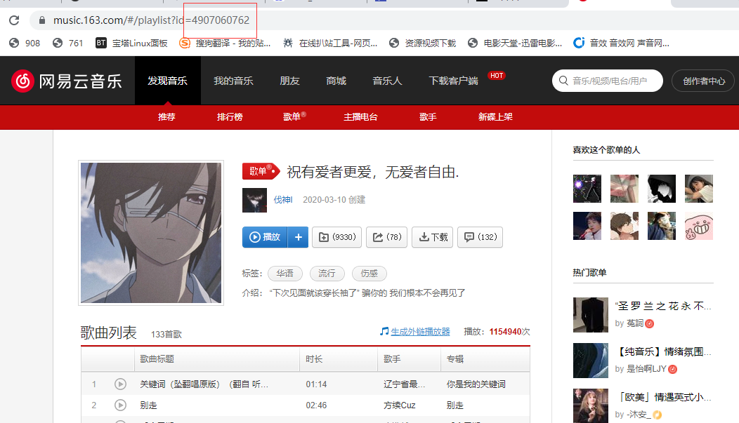
6、关于更换歌单的问题,大部分同学都因为只更改了 data-id 的值,所以出现歌单加载不出的情况,此处需要注意,data-id 、data-server 、data-type 分别对应了歌单的id,歌单的服务商、歌单的类型(感觉自己说了废话),所以需要确认这三项是一一对应的。
如图中所示,找到网易云歌单的 url,https://music.163.com/#/playlist?id=4907060762, 此处的palylist 对应的就是data-type 的值,id 就是data-id 的值,而网易云的data-server 为netease ,这个可以通过 Aplayer 的插件文档查阅到。 只有三个参数对应正确才能正常加载歌单。
7、Aplayer 的网易云歌单接口时不时的会挂掉,所以如果你确定你配置正确,但是歌单还是没有出现。不妨去看看其他人的站点是不是也没有 Aplayer 标签了来判断是 Aplayer 本身接口的问题还是自己配置出错的问题。
8、配置成功后会发现 Aplayer 的吸底标签一直占据着左下角的一片空间,对手机端阅读不太友好,可以添加一下 CSS 样式使其自动缩进隐藏。在 [Blogroot]\themes\butterfly\source\css\custom.css 中 (没有这个文件就按照路径自己新建) 添加如下内容:
1 2 3 4 5 6 7 8 9 .aplayer .aplayer-fixed .aplayer-narrow .aplayer-body { left : -66px !important ; } .aplayer .aplayer-fixed .aplayer-narrow .aplayer-body :hover { left : 0 !important ; }
9、不要忘了到主题配置文件引入自定义样式,修改 [Blogroot]_config.butterfly.yml 的 inject 配置项:
1 2 3 4 5 inject: head: + - <link rel="stylesheet" href="/css/custom.css" media="defer" onload="this.media='all'"> bottom: - <div class="aplayer no-destroy" data-id="5183531430" data-server="netease" data-type="playlist" data-fixed="true" data-mini="true" data-listFolded="false" data-order="random" data-preload="none" data-autoplay="false" muted></div>
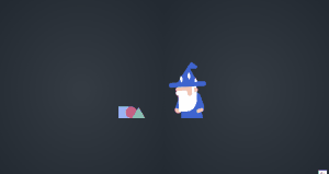
巫师施法特效
转自 Akilar《Loading Animation》 仅用于学习。
1、修改 [Blogroot]\themes\butterfly\layout\includes\loading\loading.pug,本教程算上默认的旋转盒子加载动画,一共提供7种款式,读者可以根据代码结构自行改写移除不需要的内容。
1 2 3 4 5 6 7 8 9 10 11 12 13 14 15 16 if theme.preloader.enable case theme.preloader.load_style when 'gear' include ./load_style/gear.pug when 'ironheart' include ./load_style/ironheart.pug when 'scarecrow' include ./load_style/scarecrow.pug when 'triangles' include ./load_style/triangles.pug when 'wizard' include ./load_style/wizard.pug when 'image' include ./load_style/image.pug default include ./load_style/default.pug
2、新建[Blogroot]\themes\butterfly\layout\includes\loading\load_style\wizard.pug,这是无限施法老头巫师施法加载动画。
1 2 3 4 5 6 7 8 9 10 11 12 13 14 15 16 17 18 19 20 21 22 23 #loading-box .loading-left-bg .loading-right-bg .wizard-scene .wizard-objects .wizard-square .wizard-circle .wizard-triangle .wizard .wizard-body .wizard-right-arm .wizard-right-hand .wizard-left-arm .wizard-left-hand .wizard-head .wizard-beard .wizard-face .wizard-adds .wizard-hat .wizard-hat-of-the-hat .wizard-four-point-star.--first .wizard-four-point-star.--second .wizard-four-point-star.--third
3、修改[Blogroot]\themes\butterfly\source\css\_layout\loading.styl,复制以下代码替换全部内容:
1 2 3 4 5 6 7 8 9 10 11 12 13 14 15 if hexo-config ('preloader.enable' ) if hexo-config ('preloader.load_style' ) == 'gear' @import './_load_style/gear' else if hexo-config ('preloader.load_style' ) == 'ironheart' @import './_load_style/ironheart' else if hexo-config ('preloader.load_style' ) == 'scarecrow' @import './_load_style/scarecrow' else if hexo-config ('preloader.load_style' ) == 'triangles' @import './_load_style/triangles' else if hexo-config ('preloader.load_style' ) == 'wizard' @import './_load_style/wizard' else if hexo-config ('preloader.load_style' ) == 'image' @import './_load_style/image' else @import './_load_style/default'
4、新建[Blogroot]\themes\butterfly\source\css\_load_style\wizard.styl:
1 2 3 4 5 6 7 8 9 10 11 12 13 14 15 16 17 18 19 20 21 22 23 24 25 26 27 28 29 30 31 32 33 34 35 36 37 38 39 40 41 42 43 44 45 46 47 48 49 50 51 52 53 54 55 56 57 58 59 60 61 62 63 64 65 66 67 68 69 70 71 72 73 74 75 76 77 78 79 80 81 82 83 84 85 86 87 88 89 90 91 92 93 94 95 96 97 98 99 100 101 102 103 104 105 106 107 108 109 110 111 112 113 114 115 116 117 118 119 120 121 122 123 124 125 126 127 128 129 130 131 132 133 134 135 136 137 138 139 140 141 142 143 144 145 146 147 148 149 150 151 152 153 154 155 156 157 158 159 160 161 162 163 164 165 166 167 168 169 170 171 172 173 174 175 176 177 178 179 180 181 182 183 184 185 186 187 188 189 190 191 192 193 194 195 196 197 198 199 200 201 202 203 204 205 206 207 208 209 210 211 212 213 214 215 216 217 218 219 220 221 222 223 224 225 226 227 228 229 230 231 232 233 234 235 236 237 238 239 240 241 242 243 244 245 246 247 248 249 250 251 252 253 254 255 256 257 258 259 260 261 262 263 264 265 266 267 268 269 270 271 272 273 274 275 276 277 278 279 280 281 282 283 284 285 286 287 288 289 290 291 292 293 294 295 296 297 298 299 300 301 302 303 304 305 306 307 308 309 310 311 312 313 314 315 316 317 318 319 320 321 322 323 324 325 326 327 328 329 330 331 332 333 334 335 336 337 338 339 340 341 342 343 344 345 346 347 348 349 350 351 352 353 354 355 356 357 358 359 360 361 362 363 364 365 366 367 368 369 370 371 372 373 374 375 376 377 378 379 380 381 382 383 384 385 386 387 388 389 390 391 392 393 394 395 396 397 398 399 400 401 402 403 404 405 406 407 408 409 410 411 412 413 414 415 416 417 418 419 420 421 422 423 424 425 426 427 428 429 430 431 432 433 434 435 436 437 438 439 440 441 442 443 444 445 446 447 448 449 450 451 452 453 454 455 456 457 458 459 460 461 462 463 464 465 466 467 468 469 470 471 472 473 474 475 476 477 478 479 480 481 482 483 484 485 486 487 488 489 490 491 492 493 494 495 496 497 498 499 500 501 502 503 504 505 506 507 508 509 510 511 512 513 514 515 516 517 518 519 520 521 522 523 524 525 526 527 528 529 530 531 532 533 534 535 536 537 538 539 540 541 542 543 544 545 546 547 548 549 550 551 552 553 554 555 556 557 558 559 560 561 562 563 564 565 566 567 568 569 570 571 572 573 574 575 576 577 578 579 580 581 582 583 584 585 586 587 588 589 590 591 592 593 594 595 596 597 598 599 600 601 602 603 604 605 606 607 608 609 610 611 612 613 614 615 616 617 618 619 620 621 622 623 624 625 626 627 628 629 630 631 632 633 634 635 636 637 638 639 640 641 642 643 644 645 646 647 648 649 650 651 652 653 654 655 656 657 658 659 660 661 662 663 664 665 666 667 668 669 670 671 672 673 674 675 676 677 678 679 680 681 682 683 684 685 686 687 688 689 690 691 692 693 694 695 696 697 698 699 700 701 702 703 704 705 706 707 708 709 710 711 712 713 714 715 716 717 718 719 720 721 722 723 724 725 726 727 728 729 730 731 732 733 734 735 736 737 738 739 740 741 742 743 744 745 746 747 748 749 750 751 752 753 754 755 756 757 758 759 760 761 762 763 764 765 766 767 768 769 770 771 772 773 774 775 776 777 778 779 780 781 782 783 784 785 786 787 788 789 790 791 792 793 794 795 796 797 798 799 800 801 802 803 804 805 806 807 808 809 810 811 812 813 814 815 816 817 818 819 820 821 822 823 824 825 826 827 .loading-bg position fixed z-index 1000 width 50% height 100% background var(--preloader-bg) #loading-box .loading-left-bg @extend .loading-bg left 0 .loading-right-bg @extend .loading-bg right 0 &.loaded z-index -1000 .loading-left-bg transition all 1.0s transform translate(-100% , 0 ) .loading-right-bg transition all 1.0s transform translate(100% , 0 ) #loading-box position fixed z-index 1000 display -webkit-box display flex -webkit-box-align center align-items center -webkit-box-pack center justify-content center -webkit-box-orient vertical -webkit-box-direction normal flex-direction column flex-wrap wrap width 100vw height 100vh overflow hidden &.loaded .wizard-scene display none .wizard-scene position fixed z-index 1001 display -webkit-box display flex .wizard position relative width 190px height 240px .wizard-body position absolute bottom 0 left 68px height 100px width 60px background #3f64ce &::after content "" position absolute bottom 0 left 20px height 100px width 60px background #3f64ce -webkit-transform skewX(14deg ) transform skewX(14deg ) .wizard-right-arm position absolute bottom 74px left 110px height 44px width 90px background #3f64ce border-radius 22px -webkit-transform-origin 16px 22px transform-origin 16px 22px -webkit-transform rotate(70deg ) transform rotate(70deg ) -webkit-animation right_arm 10s ease-in-out infinite animation right_arm 10s ease-in-out infinite .right-hand position absolute right 8px bottom 8px width 30px height 30px border-radius 50% background #f1c5b4 -webkit-transform-origin center center transform-origin center center -webkit-transform rotate(-40deg ) transform rotate(-40deg ) -webkit-animation right_hand 10s ease-in-out infinite animation right_hand 10s ease-in-out infinite .wizard-right-hand &::after content "" position absolute right 0px top -8px width 15px height 30px border-radius 10px background #f1c5b4 -webkit-transform translateY(16px ) transform translateY(16px ) -webkit-animation right_finger 10s ease-in-out infinite animation right_finger 10s ease-in-out infinite .wizard-left-arm position absolute bottom 74px left 26px height 44px width 70px background #3f64ce border-bottom-left-radius 8px -webkit-transform-origin 60px 26px transform-origin 60px 26px -webkit-transform rotate(-70deg ) transform rotate(-70deg ) -webkit-animation left_arm 10s ease-in-out infinite animation left_arm 10s ease-in-out infinite .wizard-left-hand position absolute left -18px top 0 width 18px height 30px border-top-left-radius 35px border-bottom-left-radius 35px background #f1c5b4 &::after content "" position absolute right 0 top 0 width 30px height 15px border-radius 20px background #f1c5b4 -webkit-transform-origin right bottom transform-origin right bottom -webkit-transform scaleX(0 ) transform scaleX(0 ) -webkit-animation left_finger 10s ease-in-out infinite animation left_finger 10s ease-in-out infinite .wizard-head position absolute top 0 left 14px width 160px height 210px -webkit-transform-origin center center transform-origin center center -webkit-transform rotate(-3deg ) transform rotate(-3deg ) -webkit-animation head 10s ease-in-out infinite animation head 10s ease-in-out infinite .wizard-beard position absolute bottom 0 left 38px height 106px width 80px border-bottom-right-radius 55% background #ffffff &::after content "" position absolute top 16px left -10px width 40px height 20px border-radius 20px background #ffffff .wizard-face position absolute bottom 76px left 38px height 30px width 60px background #f1c5b4 &::before content "" position absolute top 0px left 40px width 20px height 40px border-bottom-right-radius 20px border-bottom-left-radius 20px background #f1c5b4 &::after content "" position absolute top 16px left -10px width 50px height 20px border-radius 20px border-bottom-right-radius 0px background #ffffff .wizard-adds position absolute top 0px left -10px width 40px height 20px border-radius 20px background #f1c5b4 &::after content "" position absolute top 5px left 80px width 15px height 20px border-bottom-right-radius 20px border-top-right-radius 20px background #f1c5b4 .wizard-hat position absolute bottom 106px left 0 width 160px height 20px border-radius 20px background #3f64ce &::before content "" position absolute top -70px left 50% -webkit-transform translatex(-50% ) transform translatex(-50% ) width 0 height 0 border-style solid border-width 0 34px 70px 50px border-color transparent transparent #3f64ce transparent &::after content "" position absolute top 0 left 0 width 160px height 20px background #3f64ce border-radius 20px .wizard-hat-of-the-hat position absolute bottom 78px left 79px width 0 height 0 border-style solid border-width 0 25px 25px 19px border-color transparent transparent #3f64ce transparent &::after content "" position absolute top 6px left -4px width 35px height 10px border-radius 10px border-bottom-left-radius 0px background #3f64ce -webkit-transform rotate(40deg ) transform rotate(40deg ) .wizard-four-point-star position absolute width 12px height 12px &::after -webkit-transform rotate(156.66deg ) skew(45deg ) transform rotate(156.66deg ) skew(45deg ) &.--first bottom 28px left 46px &.--second bottom 40px left 80px &.--third bottom 15px left 108px .wizard-head .wizard-hat .wizard-four-point-star ::after , .wizard-head .wizard-hat .wizard-four-point-star ::before content "" position absolute background #ffffff display block left 0 width 141.4213% top 0 bottom 0 border-radius 10% -webkit-transform rotate(66.66deg ) skewX(45deg ) transform rotate(66.66deg ) skewX(45deg ) .wizard-objects position relative width 200px height 240px .wizard-square position absolute bottom -60px left -5px width 120px height 120px border-radius 50% -webkit-transform rotate(-360deg ) transform rotate(-360deg ) -webkit-animation path_square 10s ease-in-out infinite animation path_square 10s ease-in-out infinite &::after content "" position absolute top 10px left 0 width 50px height 50px background #9ab3f5 .wizard-circle position absolute bottom 10px left 0 width 100px height 100px border-radius 50% -webkit-transform rotate(-360deg ) transform rotate(-360deg ) -webkit-animation path_circle 10s ease-in-out infinite animation path_circle 10s ease-in-out infinite &::after content "" position absolute bottom -10px left 25px width 50px height 50px border-radius 50% background #c56183 .wizard-triangle position absolute bottom -62px left -10px width 110px height 110px border-radius 50% -webkit-transform rotate(-360deg ) transform rotate(-360deg ) -webkit-animation path_triangle 10s ease-in-out infinite animation path_triangle 10s ease-in-out infinite &::after content "" position absolute top 0 right -10px width 0 height 0 border-style solid border-width 0 28px 48px 28px border-color transparent transparent #89beb3 transparent @-webkit-keyframes right_arm 0% -webkit-transform rotate(70deg ) transform rotate(70deg ) 10% -webkit-transform rotate(8deg ) transform rotate(8deg ) 15% -webkit-transform rotate(20deg ) transform rotate(20deg ) 20% -webkit-transform rotate(10deg ) transform rotate(10deg ) 25% -webkit-transform rotate(26deg ) transform rotate(26deg ) 30% -webkit-transform rotate(10deg ) transform rotate(10deg ) 35% -webkit-transform rotate(28deg ) transform rotate(28deg ) 40% -webkit-transform rotate(9deg ) transform rotate(9deg ) 45% -webkit-transform rotate(28deg ) transform rotate(28deg ) 50% -webkit-transform rotate(8deg ) transform rotate(8deg ) 58% -webkit-transform rotate(74deg ) transform rotate(74deg ) 62% -webkit-transform rotate(70deg ) transform rotate(70deg ) @keyframes right_arm 0% -webkit-transform rotate(70deg ) transform rotate(70deg ) 10% -webkit-transform rotate(8deg ) transform rotate(8deg ) 15% -webkit-transform rotate(20deg ) transform rotate(20deg ) 20% -webkit-transform rotate(10deg ) transform rotate(10deg ) 25% -webkit-transform rotate(26deg ) transform rotate(26deg ) 30% -webkit-transform rotate(10deg ) transform rotate(10deg ) 35% -webkit-transform rotate(28deg ) transform rotate(28deg ) 40% -webkit-transform rotate(9deg ) transform rotate(9deg ) 45% -webkit-transform rotate(28deg ) transform rotate(28deg ) 50% -webkit-transform rotate(8deg ) transform rotate(8deg ) 58% -webkit-transform rotate(74deg ) transform rotate(74deg ) 62% -webkit-transform rotate(70deg ) transform rotate(70deg ) @-webkit-keyframes left_arm 0% -webkit-transform rotate(-70deg ) transform rotate(-70deg ) 10% -webkit-transform rotate(6deg ) transform rotate(6deg ) 15% -webkit-transform rotate(-18deg ) transform rotate(-18deg ) 20% -webkit-transform rotate(5deg ) transform rotate(5deg ) 25% -webkit-transform rotate(-18deg ) transform rotate(-18deg ) 30% -webkit-transform rotate(5deg ) transform rotate(5deg ) 35% -webkit-transform rotate(-17deg ) transform rotate(-17deg ) 40% -webkit-transform rotate(5deg ) transform rotate(5deg ) 45% -webkit-transform rotate(-18deg ) transform rotate(-18deg ) 50% -webkit-transform rotate(6deg ) transform rotate(6deg ) 58% -webkit-transform rotate(-74deg ) transform rotate(-74deg ) 62% -webkit-transform rotate(-70deg ) transform rotate(-70deg ) @keyframes left_arm 0% -webkit-transform rotate(-70deg ) transform rotate(-70deg ) 10% -webkit-transform rotate(6deg ) transform rotate(6deg ) 15% -webkit-transform rotate(-18deg ) transform rotate(-18deg ) 20% -webkit-transform rotate(5deg ) transform rotate(5deg ) 25% -webkit-transform rotate(-18deg ) transform rotate(-18deg ) 30% -webkit-transform rotate(5deg ) transform rotate(5deg ) 35% -webkit-transform rotate(-17deg ) transform rotate(-17deg ) 40% -webkit-transform rotate(5deg ) transform rotate(5deg ) 45% -webkit-transform rotate(-18deg ) transform rotate(-18deg ) 50% -webkit-transform rotate(6deg ) transform rotate(6deg ) 58% -webkit-transform rotate(-74deg ) transform rotate(-74deg ) 62% -webkit-transform rotate(-70deg ) transform rotate(-70deg ) @-webkit-keyframes right_hand 0% -webkit-transform rotate(-40deg ) transform rotate(-40deg ) 10% -webkit-transform rotate(-20deg ) transform rotate(-20deg ) 15% -webkit-transform rotate(-5deg ) transform rotate(-5deg ) 20% -webkit-transform rotate(-60deg ) transform rotate(-60deg ) 25% -webkit-transform rotate(0deg ) transform rotate(0deg ) 30% -webkit-transform rotate(-60deg ) transform rotate(-60deg ) 35% -webkit-transform rotate(0deg ) transform rotate(0deg ) 40% -webkit-transform rotate(-40deg ) transform rotate(-40deg ) 45% -webkit-transform rotate(-60deg ) transform rotate(-60deg ) 50% -webkit-transform rotate(10deg ) transform rotate(10deg ) 60% -webkit-transform rotate(-40deg ) transform rotate(-40deg ) @keyframes right_hand 0% -webkit-transform rotate(-40deg ) transform rotate(-40deg ) 10% -webkit-transform rotate(-20deg ) transform rotate(-20deg ) 15% -webkit-transform rotate(-5deg ) transform rotate(-5deg ) 20% -webkit-transform rotate(-60deg ) transform rotate(-60deg ) 25% -webkit-transform rotate(0deg ) transform rotate(0deg ) 30% -webkit-transform rotate(-60deg ) transform rotate(-60deg ) 35% -webkit-transform rotate(0deg ) transform rotate(0deg ) 40% -webkit-transform rotate(-40deg ) transform rotate(-40deg ) 45% -webkit-transform rotate(-60deg ) transform rotate(-60deg ) 50% -webkit-transform rotate(10deg ) transform rotate(10deg ) 60% -webkit-transform rotate(-40deg ) transform rotate(-40deg ) @-webkit-keyframes right_finger 0% -webkit-transform translateY(16px ) transform translateY(16px ) 10% -webkit-transform none transform none 50% -webkit-transform none transform none 60% -webkit-transform translateY(16px ) transform translateY(16px ) @keyframes right_finger 0% -webkit-transform translateY(16px ) transform translateY(16px ) 10% -webkit-transform none transform none 50% -webkit-transform none transform none 60% -webkit-transform translateY(16px ) transform translateY(16px ) @-webkit-keyframes left_finger 0% -webkit-transform scaleX(0 ) transform scaleX(0 ) 10% -webkit-transform scaleX(1 ) rotate(6deg ) transform scaleX(1 ) rotate(6deg ) 15% -webkit-transform scaleX(1 ) rotate(0deg ) transform scaleX(1 ) rotate(0deg ) 20% -webkit-transform scaleX(1 ) rotate(8deg ) transform scaleX(1 ) rotate(8deg ) 25% -webkit-transform scaleX(1 ) rotate(0deg ) transform scaleX(1 ) rotate(0deg ) 30% -webkit-transform scaleX(1 ) rotate(7deg ) transform scaleX(1 ) rotate(7deg ) 35% -webkit-transform scaleX(1 ) rotate(0deg ) transform scaleX(1 ) rotate(0deg ) 40% -webkit-transform scaleX(1 ) rotate(5deg ) transform scaleX(1 ) rotate(5deg ) 45% -webkit-transform scaleX(1 ) rotate(0deg ) transform scaleX(1 ) rotate(0deg ) 50% -webkit-transform scaleX(1 ) rotate(6deg ) transform scaleX(1 ) rotate(6deg ) 58% -webkit-transform scaleX(0 ) transform scaleX(0 ) @keyframes left_finger 0% -webkit-transform scaleX(0 ) transform scaleX(0 ) 10% -webkit-transform scaleX(1 ) rotate(6deg ) transform scaleX(1 ) rotate(6deg ) 15% -webkit-transform scaleX(1 ) rotate(0deg ) transform scaleX(1 ) rotate(0deg ) 20% -webkit-transform scaleX(1 ) rotate(8deg ) transform scaleX(1 ) rotate(8deg ) 25% -webkit-transform scaleX(1 ) rotate(0deg ) transform scaleX(1 ) rotate(0deg ) 30% -webkit-transform scaleX(1 ) rotate(7deg ) transform scaleX(1 ) rotate(7deg ) 35% -webkit-transform scaleX(1 ) rotate(0deg ) transform scaleX(1 ) rotate(0deg ) 40% -webkit-transform scaleX(1 ) rotate(5deg ) transform scaleX(1 ) rotate(5deg ) 45% -webkit-transform scaleX(1 ) rotate(0deg ) transform scaleX(1 ) rotate(0deg ) 50% -webkit-transform scaleX(1 ) rotate(6deg ) transform scaleX(1 ) rotate(6deg ) 58% -webkit-transform scaleX(0 ) transform scaleX(0 ) @-webkit-keyframes head 0% -webkit-transform rotate(-3deg ) transform rotate(-3deg ) 10% -webkit-transform translatex(10px ) rotate(7deg ) transform translatex(10px ) rotate(7deg ) 50% -webkit-transform translatex(0px ) rotate(0deg ) transform translatex(0px ) rotate(0deg ) 56% -webkit-transform rotate(-3deg ) transform rotate(-3deg ) @keyframes head 0% -webkit-transform rotate(-3deg ) transform rotate(-3deg ) 10% -webkit-transform translatex(10px ) rotate(7deg ) transform translatex(10px ) rotate(7deg ) 50% -webkit-transform translatex(0px ) rotate(0deg ) transform translatex(0px ) rotate(0deg ) 56% -webkit-transform rotate(-3deg ) transform rotate(-3deg ) @-webkit-keyframes path_circle 0% -webkit-transform translateY(0 ) transform translateY(0 ) 10% -webkit-transform translateY(-100px ) rotate(-5deg ) transform translateY(-100px ) rotate(-5deg ) 55% -webkit-transform translateY(-100px ) rotate(-360deg ) transform translateY(-100px ) rotate(-360deg ) 58% -webkit-transform translateY(-100px ) rotate(-360deg ) transform translateY(-100px ) rotate(-360deg ) 63% -webkit-transform rotate(-360deg ) transform rotate(-360deg ) @keyframes path_circle 0% -webkit-transform translateY(0 ) transform translateY(0 ) 10% -webkit-transform translateY(-100px ) rotate(-5deg ) transform translateY(-100px ) rotate(-5deg ) 55% -webkit-transform translateY(-100px ) rotate(-360deg ) transform translateY(-100px ) rotate(-360deg ) 58% -webkit-transform translateY(-100px ) rotate(-360deg ) transform translateY(-100px ) rotate(-360deg ) 63% -webkit-transform rotate(-360deg ) transform rotate(-360deg ) @-webkit-keyframes path_square 0% -webkit-transform translateY(0 ) transform translateY(0 ) 10% -webkit-transform translateY(-155px ) translatex(-15px ) rotate(10deg ) transform translateY(-155px ) translatex(-15px ) rotate(10deg ) 55% -webkit-transform translateY(-155px ) translatex(-15px ) rotate(-350deg ) transform translateY(-155px ) translatex(-15px ) rotate(-350deg ) 57% -webkit-transform translateY(-155px ) translatex(-15px ) rotate(-350deg ) transform translateY(-155px ) translatex(-15px ) rotate(-350deg ) 63% -webkit-transform rotate(-360deg ) transform rotate(-360deg ) @keyframes path_square 0% -webkit-transform translateY(0 ) transform translateY(0 ) 10% -webkit-transform translateY(-155px ) translatex(-15px ) rotate(10deg ) transform translateY(-155px ) translatex(-15px ) rotate(10deg ) 55% -webkit-transform translateY(-155px ) translatex(-15px ) rotate(-350deg ) transform translateY(-155px ) translatex(-15px ) rotate(-350deg ) 57% -webkit-transform translateY(-155px ) translatex(-15px ) rotate(-350deg ) transform translateY(-155px ) translatex(-15px ) rotate(-350deg ) 63% -webkit-transform rotate(-360deg ) transform rotate(-360deg ) @-webkit-keyframes path_triangle 0% -webkit-transform translateY(0 ) transform translateY(0 ) 10% -webkit-transform translateY(-172px ) translatex(10px ) rotate(-10deg ) transform translateY(-172px ) translatex(10px ) rotate(-10deg ) 55% -webkit-transform translateY(-172px ) translatex(10px ) rotate(-365deg ) transform translateY(-172px ) translatex(10px ) rotate(-365deg ) 58% -webkit-transform translateY(-172px ) translatex(10px ) rotate(-365deg ) transform translateY(-172px ) translatex(10px ) rotate(-365deg ) 63% -webkit-transform rotate(-360deg ) transform rotate(-360deg ) @keyframes path_triangle 0% -webkit-transform translateY(0 ) transform translateY(0 ) 10% -webkit-transform translateY(-172px ) translatex(10px ) rotate(-10deg ) transform translateY(-172px ) translatex(10px ) rotate(-10deg ) 55% -webkit-transform translateY(-172px ) translatex(10px ) rotate(-365deg ) transform translateY(-172px ) translatex(10px ) rotate(-365deg ) 58% -webkit-transform translateY(-172px ) translatex(10px ) rotate(-365deg ) transform translateY(-172px ) translatex(10px ) rotate(-365deg ) 63% -webkit-transform rotate(-360deg ) transform rotate(-360deg )
5、修改[Blogroot]\themes\butterfly\layout\includes\layout.pug,以适配接下来需要添加的配置项:
1 2 3 4 body - if theme.preloader + if theme.preloader.enable !=partial('includes/loading/loading', {}, {cache: true})
6、修改[Blogroot]\themes\butterfly\source\css\var.styl,添加自定义修改背景色的配置项。(大概98行的位置)
1 2 3 4 // preloader - $preloader-bg = #37474f + $preloader-bg = hexo-config('preloader.enable') && hexo-config('preloader.load_color') ? convert(hexo-config('preloader.load_color')) : #37474f $preloader-word-color = #fff
7、修改[Blogroot]\_config.butterfly.yml的preloader配置项。
1 2 3 4 5 6 7 # Loading Animation (加載動畫) - preloader: true + preloader: + enable: true # true|false + load_color: '#000000' # '#37474f' + load_style: wizard # default|gear|ironheart|scarecrow|triangles|wizard|image + load_image: # url
8、此项为非必要修改项,主要是为了避免使用image主题时,切换夜间模式后,背景色被强制覆盖为黑色,说白了就是治疗强迫症。修改[Blogroot]\themes\butterfly\source\css\_mode\darkmode.styl第10行的--preloader-bg: darken(#121212, 2)。
1 2 3 4 5 6 --search-input-color: alpha(#FFFFFF, .7) --search-result-title: alpha(#FFFFFF, .9) - --preloader-bg: darken(#121212, 2) + --preloader-bg: darken(#ca3b3e, -2) --preloader-color: alpha(#FFFFFF, .7) --tab-border-color: #2c2c2c
其中#ca3b3e是设置为image主题时,切换为夜间模式后,自定义图片的背景色值。(切换夜间模式时,整个页面会降低色调,所以连带着自定义图片的色值也变暗,需要重新取值。)
首页置顶轮播图
转自 Akilar《Swiper Bar》 仅用于学习。
1、安装插件,在博客根目录 [Blogroot] 下打开终端,运行以下指令:
1 npm install hexo-butterfly-swiper --save
2、添加配置信息,以下为写法示例_config.yml 或者主题配置文件_config.butterfly.yml 中添加:
1 2 3 4 5 6 7 8 9 10 11 12 13 14 15 16 swiper: enable: true priority: 5 enable_page: all timemode: date layout: type: id name: recent-posts index: 0 default_descr: 再怎么看我也不知道怎么描述它的啦! swiper_css: https://npm.elemecdn.com/hexo-butterfly-swiper/lib/swiper.min.css swiper_js: https://npm.elemecdn.com/hexo-butterfly-swiper/lib/swiper.min.js custom_css: https://npm.elemecdn.com/hexo-butterfly-swiper/lib/swiperstyle.css custom_js: https://npm.elemecdn.com/hexo-butterfly-swiper/lib/swiper_init.js
3、在文章的 front_matter 中添加 swiper_index 配置项即可。
1 2 3 4 5 6 7 8 --- title: 文章标题 date: 创建日期 updated: 更新日期 cover: 文章封面 description: 文章描述 swiper_index: 1 #置顶轮播图顺序,非负整数,数字越大越靠前 ---
gitcalendar
转自 Akilar《Gitcalendar》 仅用于学习。
1、安装插件,在博客根目录 [Blogroot] 下打开终端,运行以下指令:
1 npm install hexo-filter-gitcalendar --save
2、添加配置信息,以下为写法示例_config.yml 或者主题配置文件如_config.butterfly.yml 中添加:
1 2 3 4 5 6 7 8 9 10 11 12 13 14 15 16 17 18 19 20 21 22 23 24 25 26 27 28 29 30 31 32 33 34 35 36 37 38 gitcalendar: enable: true priority: 5 enable_page: / layout: type: id name: recent-posts index: 0 user: Akilarlxh apiurl: 'https://gitcalendar.akilar.top' minheight: pc: 280px mibile: 0px color: "['#e4dfd7', '#f9f4dc', '#f7e8aa', '#f7e8aa', '#f8df72', '#fcd217', '#fcc515', '#f28e16', '#fb8b05', '#d85916', '#f43e06']" container: .recent-post-item(style='width:100%;height:auto;padding:10px;') gitcalendar_css: https://npm.elemecdn.com/hexo-filter-gitcalendar/lib/gitcalendar.css gitcalendar_js: https://npm.elemecdn.com/hexo-filter-gitcalendar/lib/gitcalendar.js
侧边栏时钟
转自 Akilar《Sidebar Card Clock》 仅用于学习。
1、安装插件,在博客根目录 [Blogroot] 下打开终端,运行以下指令:
1 npm install hexo-butterfly-clock --save
2、添加配置信息,以下为写法示例_config.yml 或者主题配置文件_config.butterfly.yml 中添加:
1 2 3 4 5 6 7 8 9 10 11 12 13 14 15 16 17 electric_clock: enable: true priority: 5 enable_page: all exclude: layout: type: class name: sticky_layout index: 0 loading: https://npm.elemecdn.com/hexo-butterfly-clock/lib/loading.gif clock_css: https://npm.elemecdn.com/hexo-butterfly-clock/lib/clock.min.css clock_js: https://npm.elemecdn.com/hexo-butterfly-clock/lib/clock.min.js ip_api: https://pv.sohu.com/cityjson?ie=utf-8
版权申明美化
转自 Akilar《Copyright-beautify》 仅用于学习。
1、修改 [Blogroot]\themes\butterfly\layout\includes\post\post-copyright.pug, 直接复制以下内容替换原文件内容。此处多次用到了三元运算符作为默认项设置,在确保有主题配置文件的默认项的情况下,也可以在相应文章的 front-matter 中重新定义作者,原文链接,开源许可协议等内容。
1 2 3 4 5 6 7 8 9 10 11 12 13 14 15 16 17 18 19 20 21 22 23 24 25 26 27 28 29 30 31 32 if theme.post_copyright.enable && page.copyright !== false - let author = page.copyright_author ? page.copyright_author : config.author - let url = page.copyright_url ? page.copyright_url : page.permalink - let license = page.license ? page.license : theme.post_copyright.license - let license_url = page.license_url ? page.license_url : theme.post_copyright.license_url .post-copyright .post-copyright__title span.post-copyright-info h #[=page.title] .post-copyright__type span.post-copyright-info a(href=url_for(url))= theme.post_copyright.decode ? decodeURI(url) : url .post-copyright-m .post-copyright-m-info .post-copyright-a h 作者 .post-copyright-cc-info h=author .post-copyright-c h 发布于 .post-copyright-cc-info h=date(page.date, config.date_format) .post-copyright-u h 更新于 .post-copyright-cc-info h=date(page.updated, config.date_format) .post-copyright-c h 许可协议 .post-copyright-cc-info a.icon(rel='noopener' target='_blank' title='Creative Commons' href='https://creativecommons.org/') i.fab.fa-creative-commons a(rel='noopener' target='_blank' title=license href=url_for(license_url))=license
2、修改 [Blogroot]\themes\butterfly\source\css\_layout\post.styl, 直接复制以下内容,替换原文件。
1 2 3 4 5 6 7 8 9 10 11 12 13 14 15 16 17 18 19 20 21 22 23 24 25 26 27 28 29 30 31 32 33 34 35 36 37 38 39 40 41 42 43 44 45 46 47 48 49 50 51 52 53 54 55 56 57 58 59 60 61 62 63 64 65 66 67 68 69 70 71 72 73 74 75 76 77 78 79 80 81 82 83 84 85 86 87 88 89 90 91 92 93 94 95 96 97 98 99 100 101 102 103 104 105 106 107 108 109 110 111 112 113 114 115 116 117 118 119 120 121 122 123 124 125 126 127 128 129 130 131 132 133 134 135 136 137 138 139 140 141 142 143 144 145 146 147 148 149 150 151 152 153 154 155 156 157 158 159 160 161 162 163 164 165 166 167 168 169 170 171 172 173 174 175 176 177 178 179 180 181 182 183 184 185 186 187 188 189 190 191 192 193 194 195 196 197 198 199 200 201 202 203 204 205 206 207 208 209 210 211 212 213 214 215 216 217 218 219 220 221 222 223 224 225 226 227 228 229 230 231 232 233 234 235 236 237 238 239 240 241 242 243 244 245 246 247 248 249 250 251 252 253 254 255 256 257 258 259 260 261 262 263 264 beautify () headStyle (fontsize) padding-left : unit(fontsize + 12 , 'px' ) &:before margin-left : unit((-(fontsize + 6 )), 'px' ) font-size : unit(fontsize, 'px' ) &:hover padding-left : unit(fontsize + 18 , 'px' ) h1 , h2 , h3 , h4 , h5 , h6 transition : all .2s ease-out &:before position : absolute top : calc(50% - 7px ) color : $title -prefix-icon-color content : $title -prefix-icon line-height : 1 transition : all .2s ease-out @extend .fontawesomeIcon &:hover &:before color : $light -blue h1 headStyle (20 ) h2 headStyle (18 ) h3 headStyle (16 ) h4 headStyle (14 ) h5 headStyle (12 ) h6 headStyle (12 ) ol , ul p margin : 0 0 8px li &::marker color : $light -blue font-weight : 600 font-size : 1.05em &:hover &::marker color : var(--pseudo-hover) ul > li list-style-type : circle #article-container word-wrap : break-word overflow-wrap : break-word a color : $theme -link-color &:hover text-decoration : underline img display : block margin : 0 auto 20px max-width : 100% transition : filter 375ms ease-in .2s p margin : 0 0 16px iframe margin : 0 0 20px if hexo-config ('anchor' ) a .headerlink &:after @extend .fontawesomeIcon float : right color : var(--headline-presudo) content : '\f0c1' font-size : .95em opacity : 0 transition : all .3s &:hover &:after color : var(--pseudo-hover) h1 , h2 , h3 , h4 , h5 , h6 &:hover a .headerlink &:after opacity : 1 ol , ul ol , ul padding-left : 20px li margin : 4px 0 p margin : 0 0 8px if hexo-config ('beautify.enable' ) if hexo-config ('beautify.field' ) == 'site' beautify () else if hexo-config ('beautify.field' ) == 'post' &.post-content beautify () > :last-child margin-bottom : 0 !important #post .tag_share .post-meta &__tag-list display : inline-block &__tags display : inline-block margin : 8px 8px 8px 0 padding : 0 12px width : fit-content border : 1px solid $light -blue border-radius : 12px color : $light -blue font-size : .85em transition : all .2s ease-in-out &:hover background : $light -blue color : var(--white) .post_share display : inline-block float : right margin : 8px 0 width : fit-content .social-share font-size : .85em .social-share-icon margin : 0 4px width : w = 1.85em height : w font-size : 1.2em line-height : w .post-copyright position : relative margin : 40px 0 10px padding : 10px 16px border : 1px solid var(--light-grey) transition : box-shadow .3s ease-in-out overflow : hidden border-radius : 12px !important background-color : rgb(239 241 243 ) &:before background var(--heo-post-blockquote-bg) position absolute right -26px top -120px content '\f25e' font-size 200px font-family 'Font Awesome 5 Brands' opacity .2 &:hover box-shadow : 0 0 8px 0 rgba(232 , 237 , 250 , .6 ), 0 2px 4px 0 rgba(232 , 237 , 250 , .5 ) .post-copyright &-meta color : $light -blue font-weight : bold &-info padding-left : 6px a text-decoration : none word-break : break-word &:hover text-decoration : none .post-copyright-cc-info color : $theme -color; .post-outdate-notice position : relative margin : 0 0 20px padding : .5em 1.2em border-radius : 3px background-color : $noticeOutdate -bg color : $noticeOutdate -color if hexo-config ('noticeOutdate.style' ) == 'flat' padding : .5em 1em .5em 2.6em border-left : 5px solid $noticeOutdate -border &:before @extend .fontawesomeIcon position : absolute top : 50% left : .9em color : $noticeOutdate -border content : '\f071' transform : translateY(-50% ) .ads-wrap margin : 40px 0 .post-copyright-m-info .post-copyright-a , .post-copyright-c , .post-copyright-u display inline-block width fit-content padding 2px 5px [data-theme="dark" ] #post .post-copyright background-color #07080a text-shadow #bfbeb8 0 0 2px border 1px solid rgb(19 18 18 / 35% ) box-shadow 0 0 5px rgb(20 , 120 , 210 ) animation flashlight 1s linear infinite alternate .post-copyright-info color #e0e0e4 #post .post-copyright__title font-size 22px .post-copyright__notice font-size 15px .post-copyright box-shadow 2px 2px 5px
3、默认项的配置
4、页面覆写配置项,修改对应文章的 front-matter:
1 2 3 4 5 6 7 8 9 --- title: Copyright-beautify # 文章名称 date: 2021-03-02 13:52:46 # 文章发布日期 updated: 2021-03-02 13:52:46 # 文章更新日期 copyright_author: Nesxc # 作者覆写 copyright_ url: https://www.nesxc.com/post/hexocc.html # 原文链接覆写license: # 许可协议名称覆写 license_url: # 许可协议链接覆写 ---
打赏按钮投币彩蛋效果 1、修改 [Blogroot]\themes\butterfly\layout\includes\post\reward.pug, 整体替换为以下内容:
1 2 3 4 5 6 7 8 9 10 11 12 13 14 15 16 17 18 19 20 21 link(rel='stylesheet' href=url_for(theme.CDN.coin_css) media="defer" onload="this.media='all'" ) .post-reward button.tip-button.reward-button span.tip-button__text= _p('donate' ) .coin-wrapper .coin .coin__middle .coin__back .coin__front .reward-main ul.reward-all each item in theme.reward.QR_code - var clickTo = (item.itemlist||item).link ? (item.itemlist||item).link : (item.itemlist||item).img li.reward-item a(href=clickTo target='_blank' ) img.post-qr-code-img(src=url_for((item.itemlist||item).img) alt=(item.itemlist||item).text) .post-qr-code-desc=(item.itemlist||item).text if theme.reward.coinAudio - var coinAudio = theme.reward.coinAudio ? url_for(theme.reward.coinAudio) : 'https://npm.elemecdn.com/akilar-candyassets@1.0.16/audio/coin.mp3' audio script(defer src=url_for(theme.CDN.coin_js))
2、新建 [Blogroot]\themes\butterfly\source\css\coin.css:
1 2 3 4 5 6 7 8 9 10 11 12 13 14 15 16 17 18 19 20 21 22 23 24 25 26 27 28 29 30 31 32 33 34 35 36 37 38 39 40 41 42 43 44 45 46 47 48 49 50 51 52 53 54 55 56 57 58 59 60 61 62 63 64 65 66 67 68 69 70 71 72 73 74 75 76 77 78 79 80 81 82 83 84 85 86 87 88 89 90 91 92 93 94 95 96 97 98 99 100 101 102 103 104 105 106 107 108 109 110 111 112 113 114 115 116 117 118 119 120 121 122 123 124 125 126 127 128 129 130 131 132 133 134 135 136 137 138 139 140 141 142 143 144 145 146 147 148 149 150 151 152 153 154 155 156 157 158 159 160 161 162 163 164 165 166 167 168 169 170 171 172 173 174 175 176 177 178 179 180 181 182 183 184 185 186 187 188 189 190 .tip-button { border : 0 ; border-radius : 0.25rem ; cursor : pointer; font-size : 20px ; font-weight : 600 ; height : 2.6rem ; margin-bottom : -4rem ; outline : 0 ; position : relative; top : 0 ; transform-origin : 0% 100% ; transition : transform 50ms ease-in-out; width : auto; -webkit-tap-highlight-color : transparent; } .tip-button :active { transform : rotate (4deg ); } .tip-button .clicked { animation : 150ms ease-in-out 1 shake; pointer-events : none; } .tip-button .clicked .tip-button__text { opacity : 0 ; transition : opacity 100ms linear 200ms ; } .tip-button .clicked ::before { height : 0.5rem ; width : 60% ; background : $button-hover-color; } .tip-button .clicked .coin { transition : margin-bottom 1s linear 200ms ; margin-bottom : 0 ; } .tip-button .shrink-landing ::before { transition : width 200ms ease-in; width : 0 ; } .tip-button .coin-landed ::after { opacity : 1 ; transform : scale (1 ); transform-origin : 50% 100% ; } .tip-button .coin-landed .coin-wrapper { background : radial-gradient (circle at 35% 97% , rgba (3 , 16 , 50 , 0.4 ) 0.04rem , transparent 0.04rem ), radial-gradient (circle at 45% 92% , rgba (3 , 16 , 50 , 0.4 ) 0.04rem , transparent 0.02rem ), radial-gradient (circle at 55% 98% , rgba (3 , 16 , 50 , 0.4 ) 0.04rem , transparent 0.04rem ), radial-gradient (circle at 65% 96% , rgba (3 , 16 , 50 , 0.4 ) 0.06rem , transparent 0.06rem ); background-position : center bottom; background-size : 100% ; bottom : -1rem ; opacity : 0 ; transform : scale (2 ) translateY (-10px ); } .tip-button__text { color : #fff ; margin-right : 1.8rem ; opacity : 1 ; position : relative; transition : opacity 100ms linear 500ms ; z-index : 3 ; } .tip-button ::before { border-radius : 0.25rem ; bottom : 0 ; content : '' ; display : block; height : 100% ; left : 50% ; position : absolute; transform : translateX (-50% ); transition : height 250ms ease-in-out 400ms , width 250ms ease-in-out 300ms ; width : 100% ; z-index : 2 ; } .tip-button ::after { bottom : -1rem ; color : white; content : 'ヾ(≧O≦)〃嗷~' ; height : 110% ; left : 0 ; opacity : 0 ; position : absolute; pointer-events : none; text-align : center; transform : scale (0 ); transform-origin : 50% 20% ; transition : transform 200ms cubic-bezier (0 , 0 , 0.35 , 1.43 ); width : 100% ; z-index : 1 ; } .coin-wrapper { background : none; bottom : 0 ; height : 18rem ; left : 0 ; opacity : 1 ; overflow : hidden; pointer-events : none; position : absolute; transform : none; transform-origin : 50% 100% ; transition : opacity 200ms linear 100ms , transform 300ms ease-out; width : 100% ; } .coin { --front-y-multiplier : 0 ; --back-y-multiplier : 0 ; --coin-y-multiplier : 0 ; --coin-x-multiplier : 0 ; --coin-scale-multiplier : 0 ; --coin-rotation-multiplier : 0 ; --shine-opacity-multiplier : 0.4 ; --shine-bg-multiplier : 50% ; bottom : calc (var (--coin-y-multiplier) * 1rem - 3.5rem ); height : 3.5rem ; margin-bottom : 3.05rem ; position : absolute; right : calc (var (--coin-x-multiplier) * 34% + 16% ); transform : translateX (50% ) scale (calc (0.4 + var (--coin-scale-multiplier))) rotate (calc (var (--coin-rotation-multiplier) * -1deg )); transition : opacity 100ms linear 200ms ; width : 3.5rem ; z-index : 3 ; } .coin__front , .coin__middle , .coin__back , .coin ::before , .coin__front ::after , .coin__back ::after { border-radius : 50% ; box-sizing : border-box; height : 100% ; left : 0 ; position : absolute; width : 100% ; z-index : 3 ; } .coin__front { background : radial-gradient (circle at 50% 50% , transparent 50% , rgba (115 , 124 , 153 , 0.4 ) 54% , #c2cadf 54% ), linear-gradient (210deg , #8590b3 32% , transparent 32% ), linear-gradient (150deg , #8590b3 32% , transparent 32% ), linear-gradient (to right, #8590b3 22% , transparent 22% , transparent 78% , #8590b3 78% ), linear-gradient (to bottom, #fcfaf9 44% , transparent 44% , transparent 65% , #fcfaf9 65% , #fcfaf9 71% , #8590b3 71% ), linear-gradient (to right, transparent 28% , #fcfaf9 28% , #fcfaf9 34% , #8590b3 34% , #8590b3 40% , #fcfaf9 40% , #fcfaf9 47% , #8590b3 47% , #8590b3 53% , #fcfaf9 53% , #fcfaf9 60% , #8590b3 60% , #8590b3 66% , #fcfaf9 66% , #fcfaf9 72% , transparent 72% ); background-color : #8590b3 ; background-size : 100% 100% ; transform : translateY (calc (var (--front-y-multiplier) * 0.3181818182rem / 2 )) scaleY (var (--front-scale-multiplier)); } .coin__front ::after { background : rgba (0 , 0 , 0 , 0.2 ); content : '' ; opacity : var (--front-y-multiplier); } .coin__middle { background : #737c99 ; transform : translateY (calc (var (--middle-y-multiplier) * 0.3181818182rem / 2 )) scaleY (var (--middle-scale-multiplier)); } .coin__back { background : radial-gradient (circle at 50% 50% , transparent 50% , rgba (115 , 124 , 153 , 0.4 ) 54% , #c2cadf 54% ), radial-gradient (circle at 50% 40% , #fcfaf9 23% , transparent 23% ), radial-gradient (circle at 50% 100% , #fcfaf9 35% , transparent 35% ); background-color : #8590b3 ; background-size : 100% 100% ; transform : translateY (calc (var (--back-y-multiplier) * 0.3181818182rem / 2 )) scaleY (var (--back-scale-multiplier)); } .coin__back ::after { background : rgba (0 , 0 , 0 , 0.2 ); content : '' ; opacity : var (--back-y-multiplier); } .coin ::before { background : radial-gradient (circle at 25% 65% , transparent 50% , rgba (255 , 255 , 255 , 0.9 ) 90% ), linear-gradient (55deg , transparent calc (var (--shine-bg-multiplier) + 0% ), #e9f4ff calc (var (--shine-bg-multiplier) + 0% ), transparent calc (var (--shine-bg-multiplier) + 50% )); content : '' ; opacity : var (--shine-opacity-multiplier); transform : translateY (calc (var (--middle-y-multiplier) * 0.3181818182rem / -2 )) scaleY (var (--middle-scale-multiplier)) rotate (calc (var (--coin-rotation-multiplier) * 1deg )); z-index : 10 ; } .coin ::after { background : #737c99 ; content : '' ; height : 0.3181818182rem ; left : 0 ; position : absolute; top : 50% ; transform : translateY (-50% ); width : 100% ; z-index : 2 ; } @keyframes shake { 0% { transform : rotate (4deg ); } 66% { transform : rotate (-4deg ); } 100% { transform : rotate (); } }
3、新建 [Blogroot]\themes\butterfly\source\js\coin.js:
1 2 3 4 5 6 7 8 9 10 11 12 13 14 15 16 17 18 19 20 21 22 23 24 25 26 27 28 29 30 31 32 33 34 35 36 37 38 39 40 41 42 43 44 45 46 47 48 49 50 51 52 53 54 55 56 57 58 59 60 61 62 63 64 65 66 67 68 69 70 71 72 73 74 75 76 77 78 79 80 81 82 83 84 85 86 87 88 89 90 var tipButtons = document .querySelectorAll ('.tip-button' )function coinAudio ( var coinAudio = document .getElementById ("coinAudio" ); if (coinAudio) { coinAudio.play (); } } tipButtons.forEach ((button ) => { var coin = button.querySelector ('.coin' ) coin.maxMoveLoopCount = 90 button.addEventListener ('click' , () => { if (/Android|webOS|BlackBerry/i .test (navigator.userAgent )) return true ; if (button.clicked ) return button.classList .add ('clicked' ) setTimeout (() => { coin.sideRotationCount = Math .floor (Math .random () * 5 ) * 90 coin.maxFlipAngle = (Math .floor (Math .random () * 4 ) + 3 ) * Math .PI button.clicked = true flipCoin () coinAudio () }, 50 ) }) var flipCoin = ( coin.moveLoopCount = 0 flipCoinLoop () } var resetCoin = ( coin.style .setProperty ('--coin-x-multiplier' , 0 ) coin.style .setProperty ('--coin-scale-multiplier' , 0 ) coin.style .setProperty ('--coin-rotation-multiplier' , 0 ) coin.style .setProperty ('--shine-opacity-multiplier' , 0.4 ) coin.style .setProperty ('--shine-bg-multiplier' , '50%' ) coin.style .setProperty ('opacity' , 1 ) setTimeout (() => { button.clicked = false }, 300 ) } var flipCoinLoop = ( coin.moveLoopCount ++ var percentageCompleted = coin.moveLoopCount / coin.maxMoveLoopCount coin.angle = -coin.maxFlipAngle * Math .pow ((percentageCompleted - 1 ), 2 ) + coin.maxFlipAngle coin.style .setProperty ('--coin-y-multiplier' , -11 * Math .pow (percentageCompleted * 2 - 1 , 4 ) + 11 ) coin.style .setProperty ('--coin-x-multiplier' , percentageCompleted) coin.style .setProperty ('--coin-scale-multiplier' , percentageCompleted * 0.6 ) coin.style .setProperty ('--coin-rotation-multiplier' , percentageCompleted * coin.sideRotationCount ) coin.style .setProperty ('--front-scale-multiplier' , Math .max (Math .cos (coin.angle ), 0 )) coin.style .setProperty ('--front-y-multiplier' , Math .sin (coin.angle )) coin.style .setProperty ('--middle-scale-multiplier' , Math .abs (Math .cos (coin.angle ), 0 )) coin.style .setProperty ('--middle-y-multiplier' , Math .cos ((coin.angle + Math .PI / 2 ) % Math .PI )) coin.style .setProperty ('--back-scale-multiplier' , Math .max (Math .cos (coin.angle - Math .PI ), 0 )) coin.style .setProperty ('--back-y-multiplier' , Math .sin (coin.angle - Math .PI )) coin.style .setProperty ('--shine-opacity-multiplier' , 4 * Math .sin ((coin.angle + Math .PI / 2 ) % Math .PI ) - 3.2 ) coin.style .setProperty ('--shine-bg-multiplier' , -40 * (Math .cos ((coin.angle + Math .PI / 2 ) % Math .PI ) - 0.5 ) + '%' ) if (coin.moveLoopCount < coin.maxMoveLoopCount ) { if (coin.moveLoopCount === coin.maxMoveLoopCount - 6 ) button.classList .add ('shrink-landing' ) window .requestAnimationFrame (flipCoinLoop) } else { button.classList .add ('coin-landed' ) coin.style .setProperty ('opacity' , 0 ) setTimeout (() => { button.classList .remove ('clicked' , 'shrink-landing' , 'coin-landed' ) setTimeout (() => { resetCoin () }, 300 ) }, 1500 ) } } })
4、修改_config.butterfly.yml, 添加音频文件配置项,添加 CDN 配置项:
1 2 3 4 5 6 7 8 9 10 11 12 13 14 15 16 17 # Sponsor/reward reward: enable: true + coinAudio: https://npm.elemecdn.com/akilar-candyassets@1.0.16/audio/coin.mp3 QR_code: 。 。 。 CDN: # main main_css: /css/index.css jquery: https://npm.elemecdn.com/jquery@latest/dist/jquery.min.js main: /js/main.js utils:/js/utils.js + # 打赏按钮投币效果 + coin_js: /js/coin.js + coin_css: /css/coin.css
5、现在的打赏按钮样式需要稍作适配,当前若提示语太长,悬停时会无法显示完全。需要微调一下,修改 [Blogroot]\themes\butterfly\source\css\_layout\reward.styl,整体替换为以下内容:
1 2 3 4 5 6 7 8 9 10 11 12 13 14 15 16 17 18 19 20 21 22 23 24 25 26 27 28 29 30 31 32 33 34 35 36 37 38 39 40 41 42 43 44 45 46 47 48 49 50 51 52 53 54 55 56 57 58 59 60 61 62 63 64 65 66 67 68 69 70 71 .post-reward position : relative margin-top : 4rem width : 100% text-align : center .reward-button display : inline-block padding : .2rem 1.2rem background : var(--btn-bg) color : var(--btn-color) cursor : pointer transition : all .4s &:hover box-shadow : inset 15em 0 0 0 var(--btn-hover-color) .reward-main display : block .reward-main position : absolute bottom : 40px left : -25% z-index : 100 display : none padding : 0 0 15px width : 150% .reward-all display : inline-block margin : 0 padding : 1rem .5rem border-radius : 4px background : var(--reward-pop) &:before position : absolute bottom : -10px left : 0 width : 100% height : 20px content : '' &:after position : absolute right : 0 bottom : 2px left : 0 margin : 0 auto width : 0 height : 0 border-top : 13px solid var(--reward-pop) border-right : 13px solid transparent border-left : 13px solid transparent content : '' .reward-item display : inline-block padding : 0 8px list-style-type : none vertical-align : top img width : 130px height : 130px .post-qr-code-desc padding-top : .4rem width : 130px color : $reward -pop-up-color
还可以针对自己的情况适度调整以下内容:
页脚振翅蝴蝶动效 1、引入相应的图标资源,修改_config.butterfly.yml,在 inject 配置项添加图标库 js。此处为我的图标库链接,掌握前置教程后可以改成自己的。
1 2 3 4 5 6 inject: head: - <link rel="stylesheet" href="/css/custom.css" media="defer" onload="this.media='all'"> bottom: - <script async src="//at.alicdn.com/t/font_2032782_8ns648avijk.js"></script>
2、新建 [Blogroot]\themes\butterfly\source\css\custom.css, 在里面添加图标默认样式和振翅蝴蝶动画。
1 2 3 4 5 6 7 8 9 10 11 12 13 14 15 16 17 18 19 .icon { width : 1em ; height : 1em ; vertical-align : -0.15em ; fill: currentColor; overflow : hidden; } .copyright svg{ animation :butterfly 1s linear infinite alternate; } @keyframes butterfly { from { transform :rotateY (70deg ); } to { transform :rotateY (0deg ); } }
3、修改 [Blogroot]\themes\butterfly\layout\includes\footer.pug:
1 2 3 4 5 6 7 8 9 10 11 12 13 14 15 16 17 18 19 20 #footer-wrap if theme.footer.owner.enable - var now = new Date() - var nowYear = now.getFullYear() - if theme.footer.owner.since && theme.footer.owner.since != nowYear - .copyright!= `©${theme.footer.owner.since} - ${nowYear} By ${config.author}` - else - .copyright!= `©${nowYear} By ${config.author}` + if theme.footer.owner.since && theme.footer.owner.since != nowYear + .copyright + span!= `©${theme.footer.owner.since} - ${nowYear}` + svg(style="width:1.5em; height:1.5em" aria-hidden="true") + use(xlink:href="#icon-Butterfly") + span!= `${config.author}` + else + .copyright + span!= `©${nowYear}` + svg(style="width:1.5em; height:1.5em" aria-hidden="true") + use(xlink:href="#icon-Butterfly") + span!= `${config.author}`
4、事实上直接用 emoji 的🦋,配合 fontawesome-animation 也能做到类似效果,甚至还可以使用 base64 的图片,但是图标呈现的不论是色彩还是动效都不如用 iconfont 来的漂亮。这里的动画用到了 rotateY, 三维上其实是图标在绕着 Y 轴旋转,降维到二维以后就呈现出了对折振翅的效果,但是人脑是很神奇的,因为左右半脑的发达程度不均,有的人还是能看到蝴蝶其实是在旋转而不是振翅。当然也不乏切换自如的人才。这个就只能仁者见仁智者见智了。
友链朋友圈 你是否经常烦恼于友链过多但没有时间浏览?那么友链朋友圈将解决这一痛点。你可以随时获取友链网站的更新内容,并了解友链的活跃情况 。
参考文档:友链朋友圈
推荐使用默认的部署方式,即:github+leancloud+vercel ,整个部署均在云端完成。运行原理:
通过github action启动爬虫抓取友链文章数据
数据由爬虫推送至数据库保存(默认为leancloud,可以自行更改)
vercel部署的api从数据库获取数据交付给前端
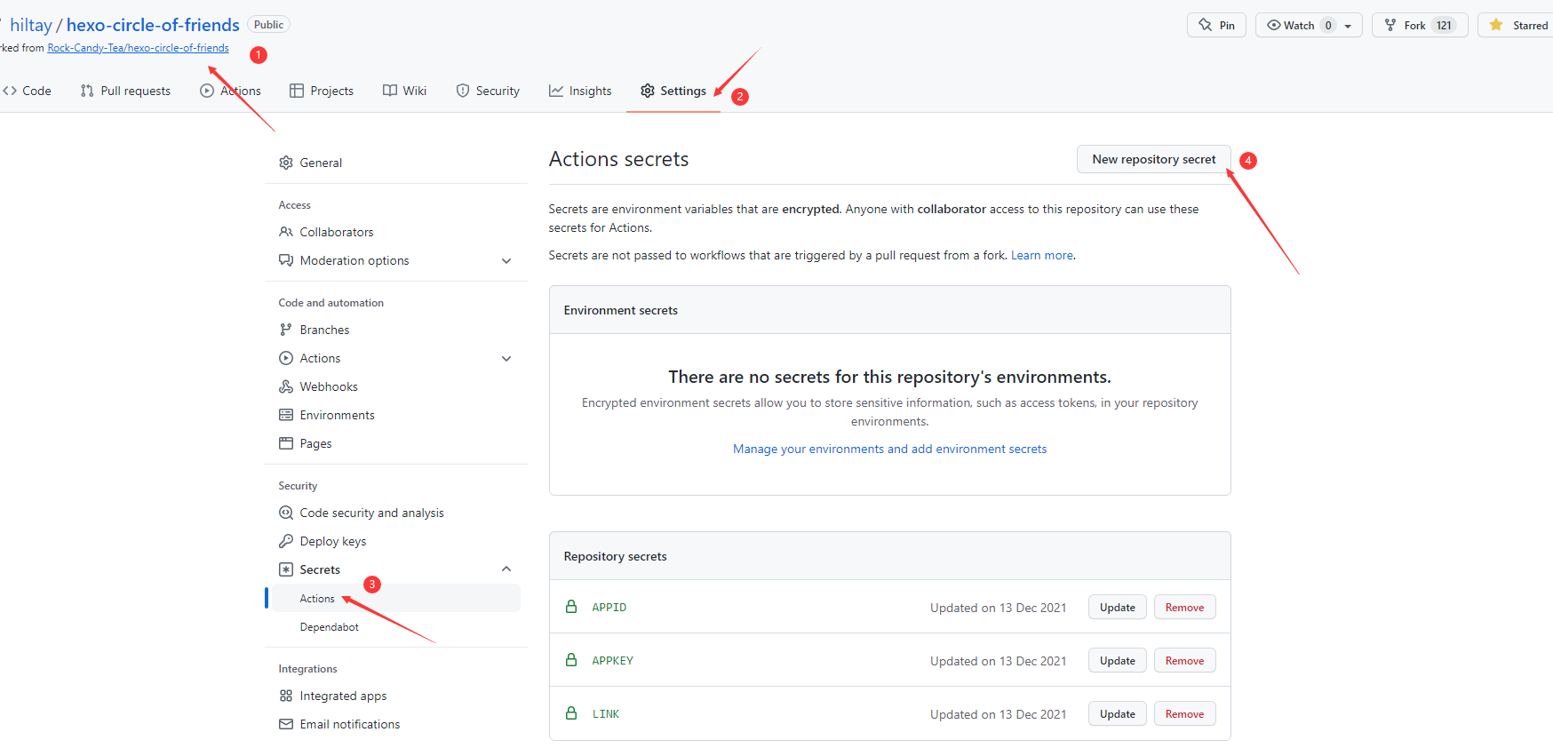
后端部署 fork友链朋友圈的项目仓库,地址:https://github.com/Rock-Candy-Tea/hexo-circle-of-friends
在fork后仓库中,编辑仓库中的/hexo_circle_of_friends/setting.py文件,必须修改的配置如下:
1 2 3 4 5 6 LINK = [ { "link" :"https://www.yyyzyyyz.cn/link/" , "theme" :"butterfly" }, ]
然后点击仓库的Settings-->Secrets-->New repository secret :
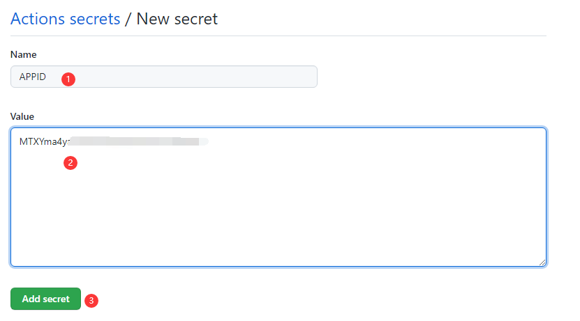
添加环境变量secert,数据库选择的是leancloud,请添加APPID和APPKEY
下面演示使用leancloud的存储方式,首先需要创建leancloud数据库,创建方式见这里 。
📢注意:前往leancloud国际版官网 注册账号并登录。
如下图所示,在仓库分别添加APPID和APPKEY,获取方式见这里 。
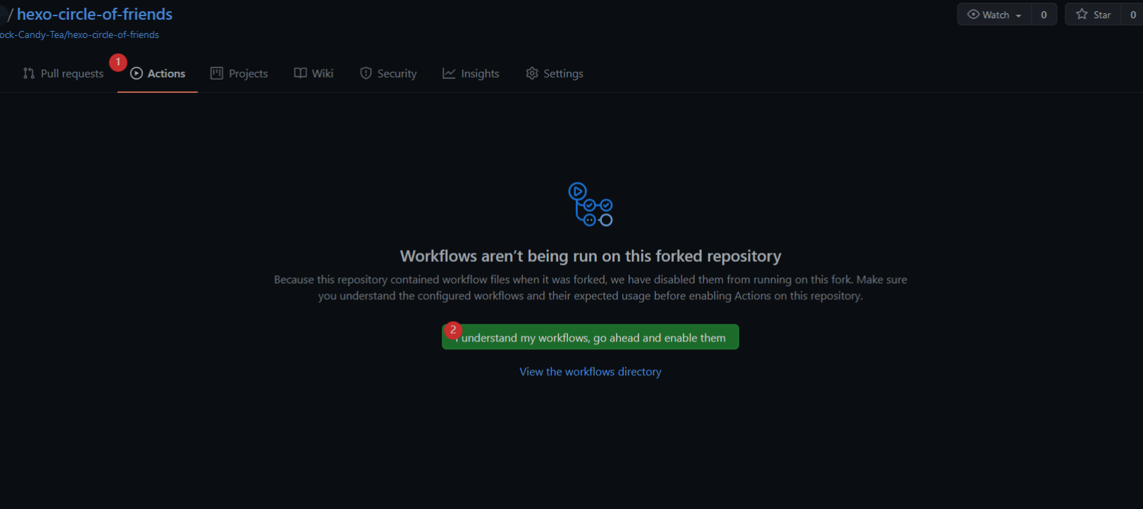
启用fork后仓库的 github action,点击Actions-->I understand my workflows, go ahead and enable them
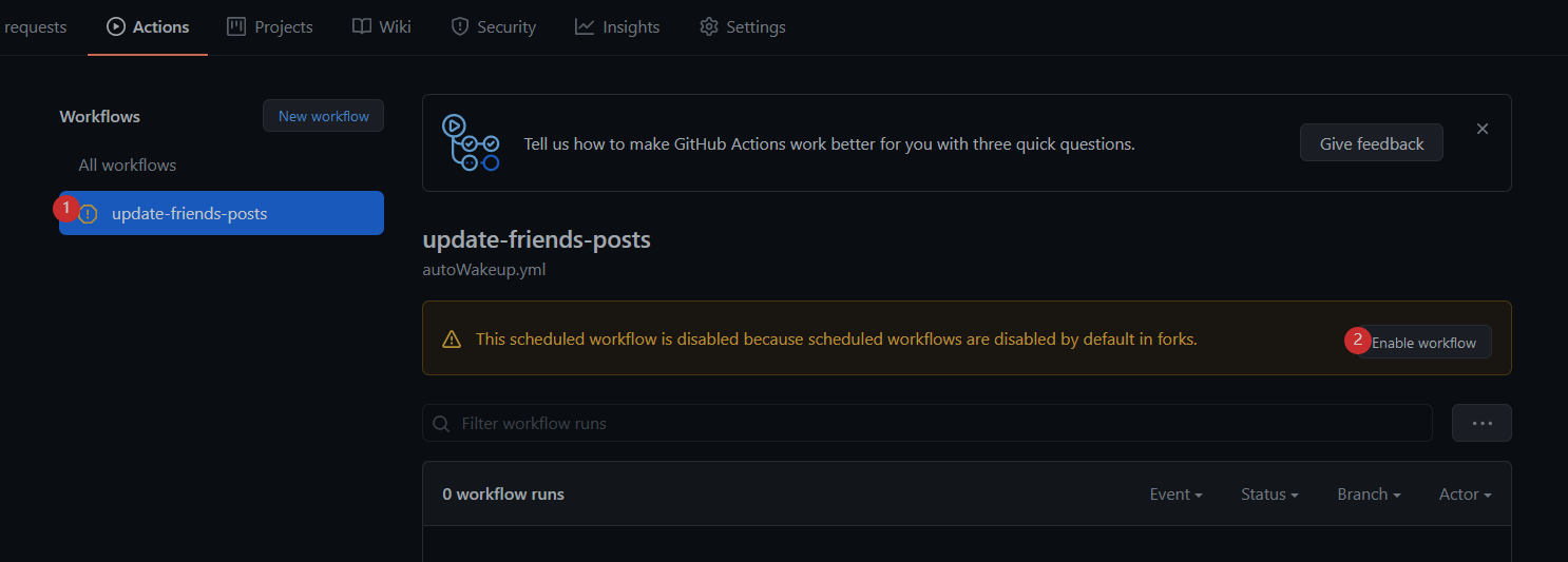
之后点击update-friends-posts并启用workflow
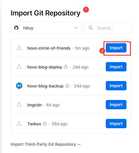
前往 vercel官网 ,直接用github创建账号并用手机号绑定。
点击New Project新建项目
找到Import Git Repository,应该可以看见你刚刚fork的仓库,点击Import。
添加环境变量,其中:
如果数据库使用leancloud,请添加APPID和APPKEY
如果数据库使用mysql,请添加登录用户名MYSQL_USERNAME,登录密码MYSQL_PASSWORD,数据库IP地址MYSQL_IP,要连接到的库的名称MYSQL_DB
如果数据库使用sqlite,不需要配置
如果数据库选择的是mongodb,请添加MONGODB_URI
添加完成后,点击 Deploy。
回到首页,等待一会,应该会部署完成。
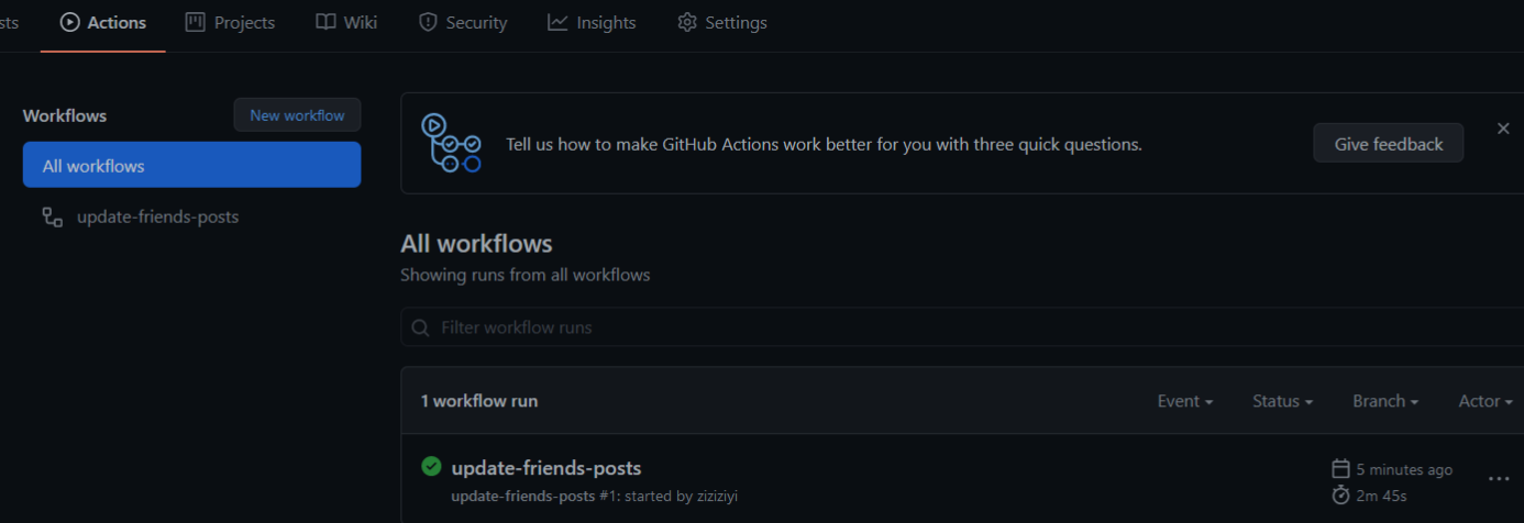
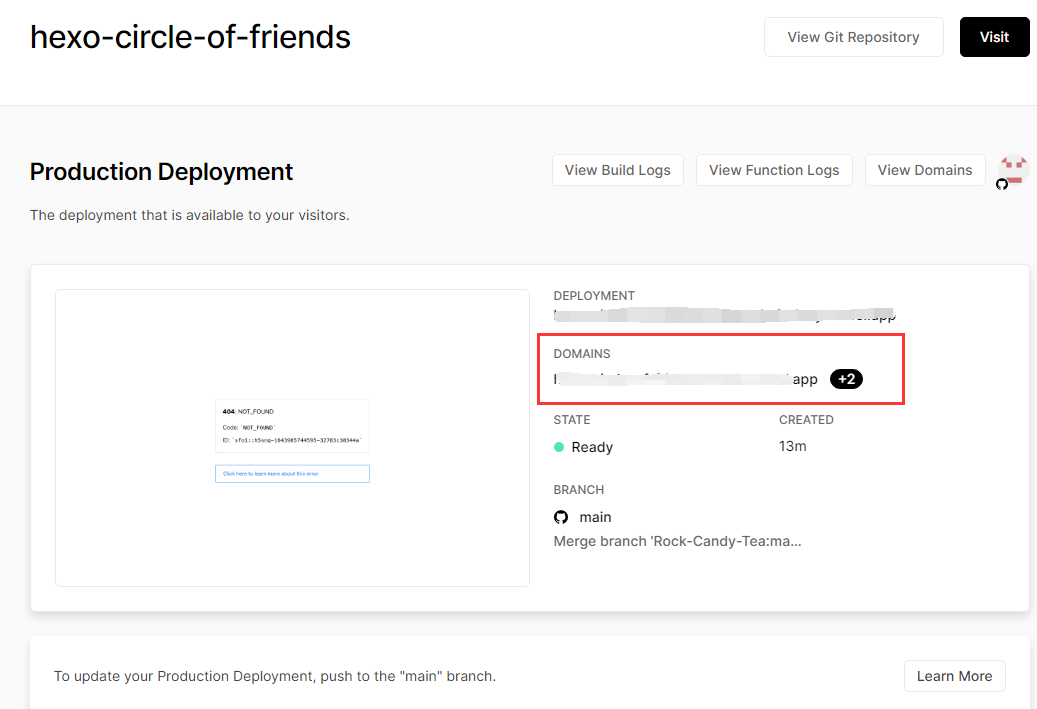
之后回到点击仓库star来完成第一次程序运行,不出意外的话结果如下图:
(这时刚刚的leancloud上也能看到上传的数据。)此后在每天的0,6,12,18,21点整,都会自动启动爬虫进行爬取。
在vercel找到DOMAINS下面的地址,如:https://hexo-friendcircle4-api.vercel.app ,前端需要的就是这个地址。
在这个地址后面拼接/all尝试访问,出现数据就说明配置成功。
前端方案
转自 Akilar 《hexo-filter-fcircle》 仅用于学习
1、安装插件,在博客根目录 [Blogroot] 下打开终端,运行以下指令:
1 2 npm uninstall hexo-butterfly-fcircle --save npm install hexo-filter-fcircle --save
2、添加配置信息_config.yml 或者主题配置文件例如_config.butterfly.yml 中添加:
1 2 3 4 5 6 7 8 9 10 11 12 13 fcircle: enable: true apiurl: https://hexo-friendcircle-api.vercel.app/api initnumber: 20 stepnumber: 10 css: js: path: front_matter: title: 朋友圈 comments: false


(opens new window)